The problem
We received an internal email highlighting a recurring customer issue with pre-ordering champagne through Manage My Booking (MMB):
“We seem to have a problem with the UX around the pre-ordering of Champagne. Most days we get a complaint from someone who thinks they should be served a bottle they have pre-purchased on their outbound flight eg Manchester to Vegas but they actually purchased it for their inbound flight Vegas to Manchester. I guess they are booking close to departure when it isn’t possible to book for their outbound and they are getting confused. Please can you look at making it clear what flight people are adding extras too as like I say this seems to be a common problem.“
At first glance, the issue was not immediately obvious. When reviewing the journey more than 72 hours before departure, the champagne pre-order experience appeared clear and functional.
At this stage, customers could see both outbound and inbound flights and assign champagne pre-orders accordingly, which aligned with expectations.
The problem only surfaced when viewing the journey within 72 hours of departure.
When a customer had less than 72 hours before their outbound flight, they could no longer pre-order champagne for that flight. However, the interface still allowed champagne to be purchased for the inbound flight only. This limitation was not clearly communicated, leading many customers to assume they were purchasing champagne for their outbound journey.
As a result, customers arrived on board expecting champagne they had technically purchased, just not for the flight they were currently on.
Validation and discovery
I met with Simon Muddimer, who raised the issue, to better understand the operational context. I also spoke directly with the call centre teams who handled complaints and customer queries.
Their feedback confirmed a consistent pattern. Customers booking close to departure were unintentionally purchasing champagne for the inbound flight, believing it applied to their outbound journey. This misunderstanding was a frequent cause of complaints and created unnecessary friction for both customers and staff.
At this point, the core UX problem was clear. The interface did not make it obvious which flight a pre-order was being applied to, particularly when options were restricted due to time constraints.
Design goals
The primary objective was clarity. Users needed to clearly understand:
- Which flights were eligible for champagne pre-ordering
- Which specific flight their selection would apply to
- Why certain options were unavailable
A secondary goal was speed of delivery. This was a known pain point with measurable impact, so I aimed to stay close to existing patterns and components to enable a quicker development turnaround.
Sketching and early concepts
I began by sketching a revised layout that clearly separated outbound and inbound flights into distinct sections, each with visible flight details.
Rather than removing the outbound option entirely within 72 hours of departure, I proposed disabling it. This allowed us to preserve context while clearly signalling that pre-ordering was no longer available for that flight.
Alongside the disabled state, I introduced explanatory messaging to set expectations and guide users towards alternative options, such as contacting the ancillaries team directly.
This approach ensured users could still see both flights, understand the limitation, and avoid mistakenly assigning a pre-order to the wrong journey.
Wireframes
I translated the sketches into wireframes and shared them with stakeholders across product, development, and customer support.
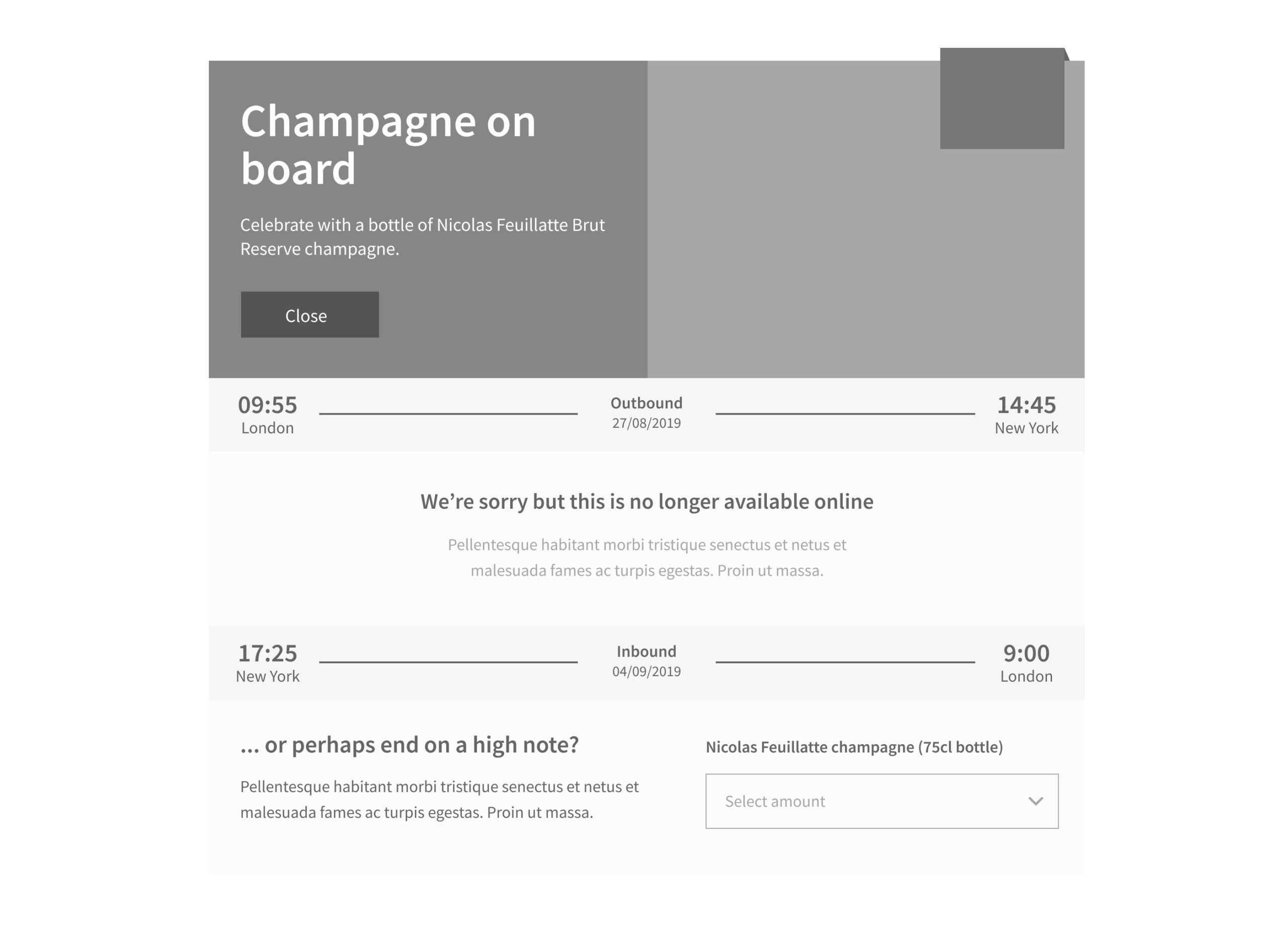
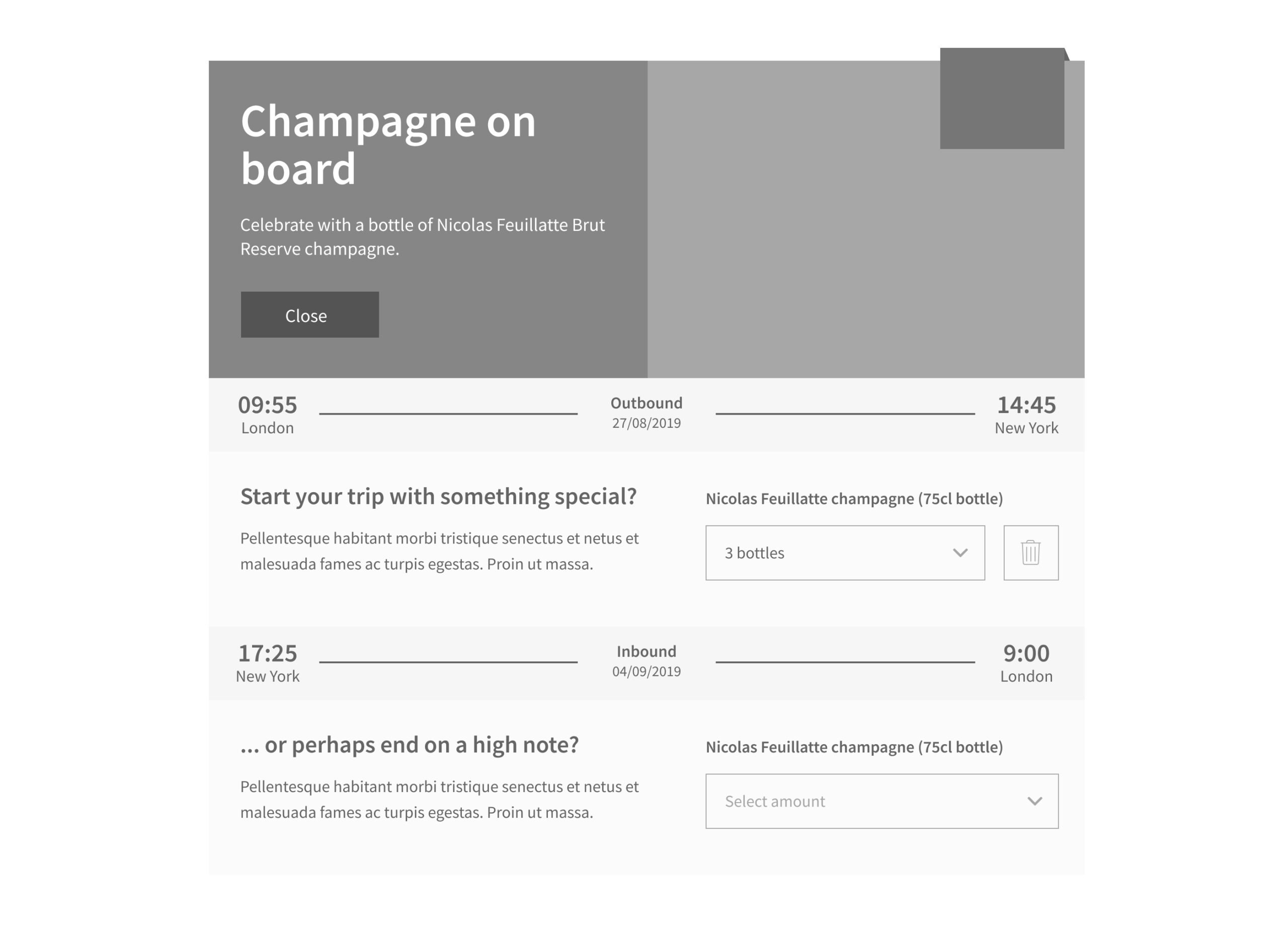

The wireframes demonstrated:
-
Clear separation of outbound and inbound flights
-
Explicit flight details within each section
-
Active, disabled, and selected states for pre-ordering
-
Messaging that explained availability constraints
These flows made it immediately obvious which flight a user was interacting with, even under time restrictions.
Hi-fidelity designs and development constraints
Following feedback and approval of the wireframes, I produced hi-fidelity designs for both desktop and mobile.
During this stage, I worked closely with the Lead Developer to ensure the solution could be delivered quickly. To reduce development effort and risk, we agreed to reuse some existing input components and styles.
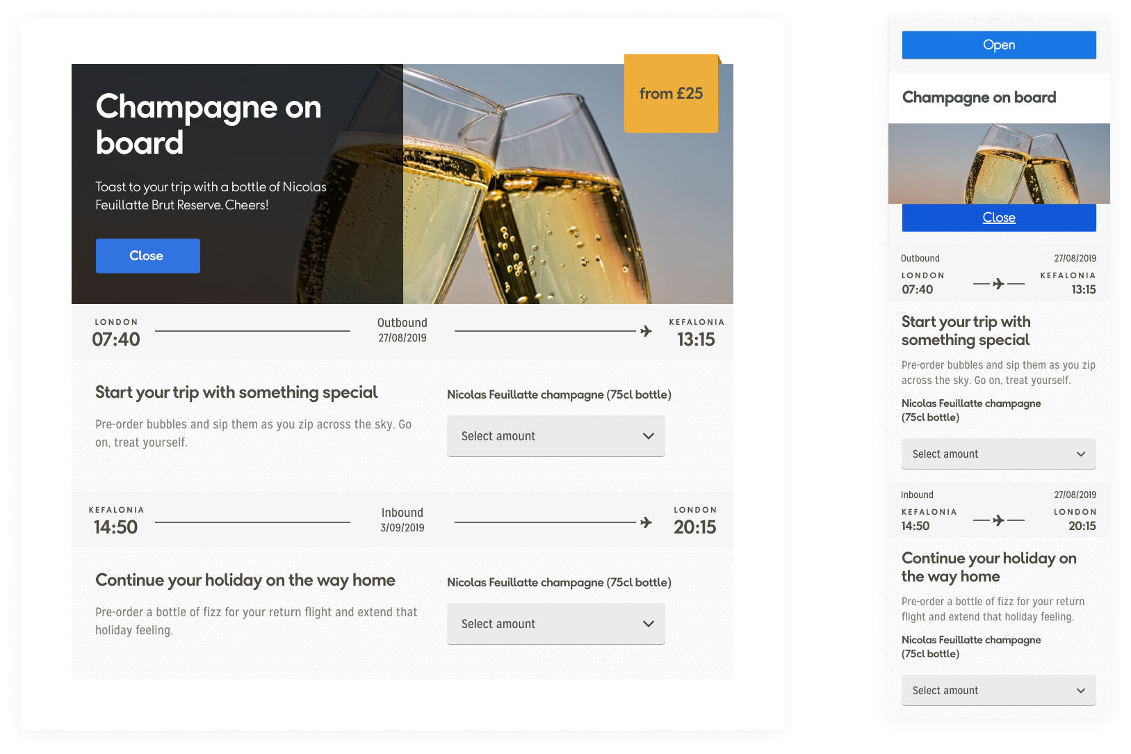
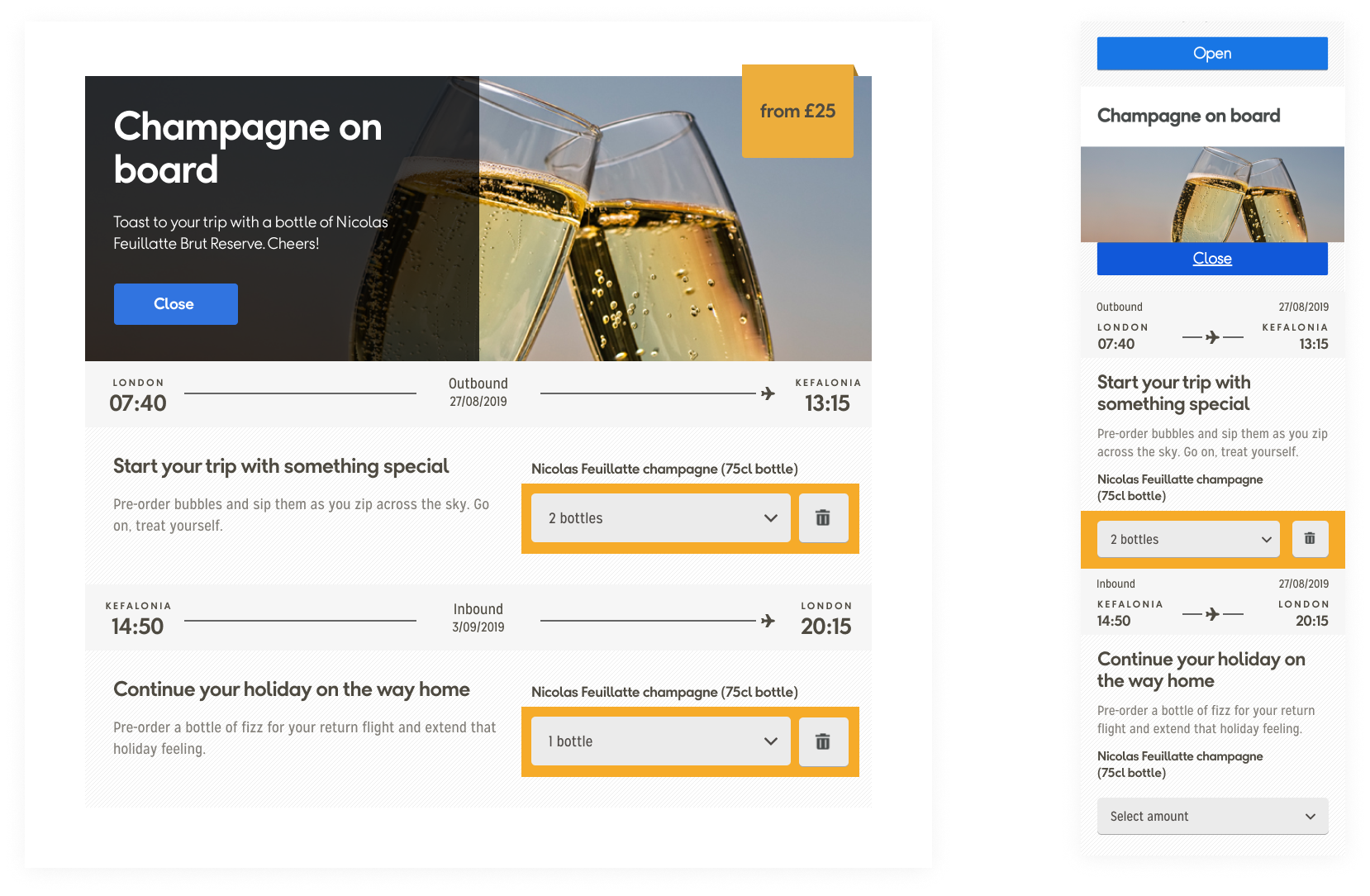
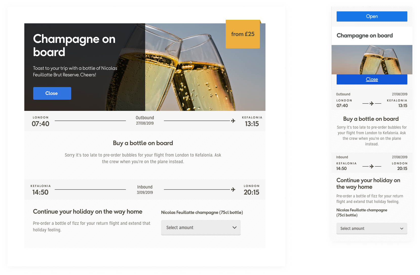
This required a small design compromise, including retaining the existing yellow highlight around the dropdown. While this was not part of my original design intent, it aligned with existing behaviour and helped the change get signed off without delay.
Improving the accordion interaction
While reviewing the component holistically, I identified an additional usability issue.
The champagne pre-order sat within an accordion. When opened, the “Close” button appeared at the top of the expanded content rather than at the bottom. On mobile, this meant users had to scroll back up to close the section after making a selection.
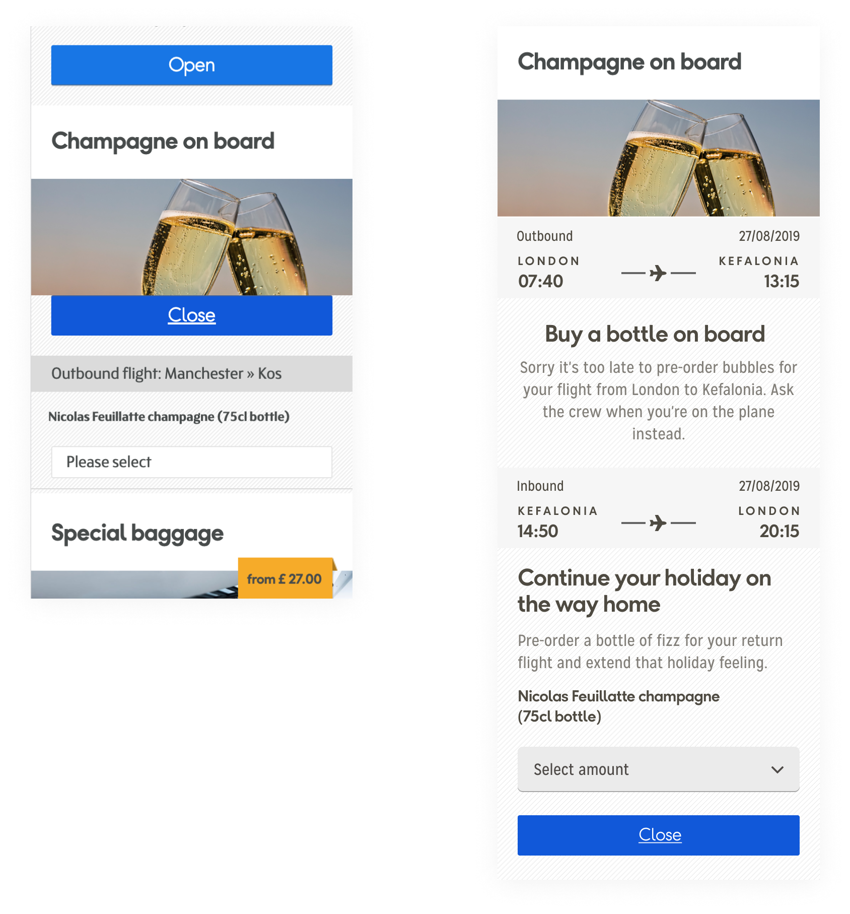
I proposed moving the “Close” action to the bottom of the expanded content, aligning it with user expectations and reducing unnecessary scrolling.
This improvement was accepted and shipped alongside the main changes.
The result
The redesigned champagne pre-order experience went live with clearer flight attribution, improved messaging, and a more intuitive interaction pattern.
The impact was immediate.
Complaints relating to champagne not being served on flights effectively disappeared. Feedback from the call centre confirmed that the issue had been resolved and that customer confusion had been eliminated.
“Hi Steve,
Just dropping you a quick thank you for your work on the champagne stuff you did a month and a bit ago. I’ve been in touch with the call centre and they said they haven’t had a complaint about the issues for a long time!!
Cheers mate,
Si”
A small change, a big win, and significantly fewer disappointed passengers waiting for champagne that was technically on another continent.
Cheers to that. 🥂


