Overview
This project was focused on creating a brand-new Design System for a major bank that was going through a complete rebrand. The rebrand was a huge moment for the organisation. It wasn’t just about changing the logo or colours. It was about repositioning the bank as modern, confident and customer-focused. Alongside the rebrand, the bank was also preparing to launch a brand-new savings product. This would be the first of many products to carry the new look and feel.
The Design System needed to provide the foundation for both the rebrand and this important product launch. It had to be flexible, accessible and easy to work with, giving product teams everything they needed to build consistently, even when working on completely different platforms or customer journeys.
One of the biggest challenges was that the bank didn’t just have one product. It had several services and platforms, each with slightly different design patterns. On top of that, the wider business had other brands under its umbrella. Over time, these had all started to drift apart visually.

While we unfortunately weren’t able to rebrand these products with the new branding, there was the potential to align some of these products with principles set by the new Design System.
We chose to use Material UI as the starting point. Its structure gave us flexibility, strong accessibility support and clear documentation for engineering teams. But we didn’t want to use Material straight out of the box. It was important that the system felt like a true expression of the new brand, rather than just a slightly styled version of someone else’s framework.
That meant defining colours, typography, spacing, interaction patterns and behaviours that would reflect the bank’s new personality. It also meant working closely with engineers to build a shared library of components that could be rolled out across all the bank’s product teams.
In short, this project was about much more than visual design. It was about creating the foundations of a new brand identity, supporting the launch of a key savings product, and setting the business up for future success with a flexible, scalable and consistent Design System.
Creating the Atoms
We started with the atoms, the smallest and most important building blocks of the Design System. These were the foundations that everything else would sit on, so getting them right was a key part of the project.
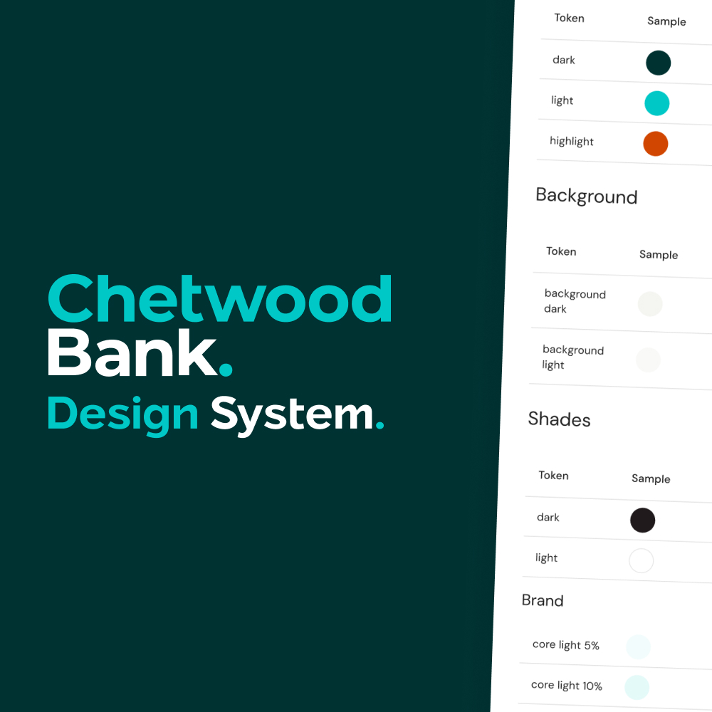
For the colour palette, we were given a set of brand colours from an external agency. These had been developed as part of the wider rebrand, and our job was to translate them into a usable, accessible set of tokens for digital use. We built out a full palette with primary, secondary and neutral shades, making sure we had the flexibility to handle different use cases like buttons, alerts and backgrounds. Accessibility was baked in from the start. Every colour choice was checked for contrast to make sure text was always readable, no matter the combination.

(Fun fact: The colours were actually delivered to us during the ModaMortgages rebrand, so we sorta had a heads-up on what we were dealing with beforehand.)
Typography was another important focus. We were provided with DM Sans as the brand typeface, and I personally took on the task of auditing the existing products. Over time, these products had collected a messy range of different font sizes, weights and styles. There was no clear system, which made things feel inconsistent and unstructured.
I gathered every type style being used across the products and mapped them out, then worked with the team to bring them into a single, sensible scale.


The result was a clean, flexible typography system with a clear hierarchy. Heading sizes, body text, captions, everything had a purpose and a consistent relationship to each other. This made designs easier to create, easier to read and far more consistent across the different journeys.
The ModaMortgages sideshow
One thing to note was that with ModaMortgages superseding the Design System, a decision was made from a branding perspective to use a combination of Montserrat (the bank’s old font) and Hind for that particular project.
The switch over to DM Sans for Chetwood caught us by surprise, and as a result we had to think outside of the box when it came to maintaining two sets of branding fonts within the Design System. As UX Designers, we had to be extra careful when working on projects.

The result was a clean, flexible typography system with a clear hierarchy. Heading sizes, body text, captions — everything had a purpose and a consistent relationship to each other. This made designs easier to create, easier to read and far more consistent across the different journeys.
Spacing was also defined early on to make sure that layouts felt balanced and predictable. We followed a simple spacing scale that could adapt across devices, giving us flexibility without losing consistency.
By getting the atoms right (colour, typography, spacing) we laid a strong foundation for the rest of the system. These choices gave the team confidence that everything built on top of them would feel part of the same family, supporting both the rebrand and the launch of new products going forward.
Output
The final output of this work was a fully structured Design System that brought clarity and consistency to the bank’s digital products. What started as a collection of scattered styles and mismatched components became a single, unified source of truth that teams could rely on.
We delivered a full library of reusable components, all built on top of Material UI but fully tailored to the new brand. These included everything from buttons, form inputs and navigation patterns, through to more complex UI elements like tables, tabs and cards. Each component was designed to be flexible, accessible and easy for teams to pick up and use.

Alongside the components, we provided clear documentation (available on Confluence to anyone in the company) to explain how and when to use each one. This made it easy for designers and developers to build with confidence, knowing that they were staying true to the brand while also creating good, accessible experiences for users.


The result was a system that gave the whole business a fresh start. It supported the rebrand, gave the new savings product a polished and professional feel, and set the foundations for future products to be built quickly and consistently.
Publishing the Design System
Once the foundations were in place and the components had been designed, the next key step was publishing the Design System in Figma. This was about making sure that everything we’d created was easy to access, easy to use and fully connected across teams.
We structured the Design System in Figma as a dedicated library, splitting it into clear sections for colours, typography, icons, components and patterns. Each element was organised and named consistently to make it simple for designers to find exactly what they needed. Components were built using Figma’s auto layout and variants, giving teams flexibility while still keeping things consistent.
One of the biggest advantages of working this way was the ability to publish the library and make it available across multiple Figma files. Product teams could then link directly to the system, meaning they didn’t have to copy or recreate components.


Whenever the Design System was updated, those changes would automatically flow through into any linked files. This helped keep everything aligned and reduced the risk of different teams drifting apart in their work.
We also made use of Figma’s documentation features, adding notes and guidance alongside key components to help explain usage. This made the system not just a set of components, but a working tool that supported good design decisions.
By publishing the system properly in Figma and linking it across projects, we gave teams a reliable, up-to-date resource that would grow alongside the products they were building. It was a big step towards creating a more joined-up, collaborative design culture across the business.