Overview
This project was about adding a bit more life and personality to the credit card app’s experience, using small, purposeful animations in the app’s iconography. The product already worked well, but some of the interactions felt a little flat, especially around key actions like completing a payment or receiving a new card.
The goal wasn’t to add animation for the sake of it. We wanted to make the app feel more polished, responsive, and enjoyable to use. Subtle motion can help guide users’ attention, provide feedback on their actions, and bring in a bit of brand personality.
The animations were designed to be small, quick, and unobtrusive. They’re the kind of details that most users won’t consciously notice, but they help the whole experience feel smoother and more considered.

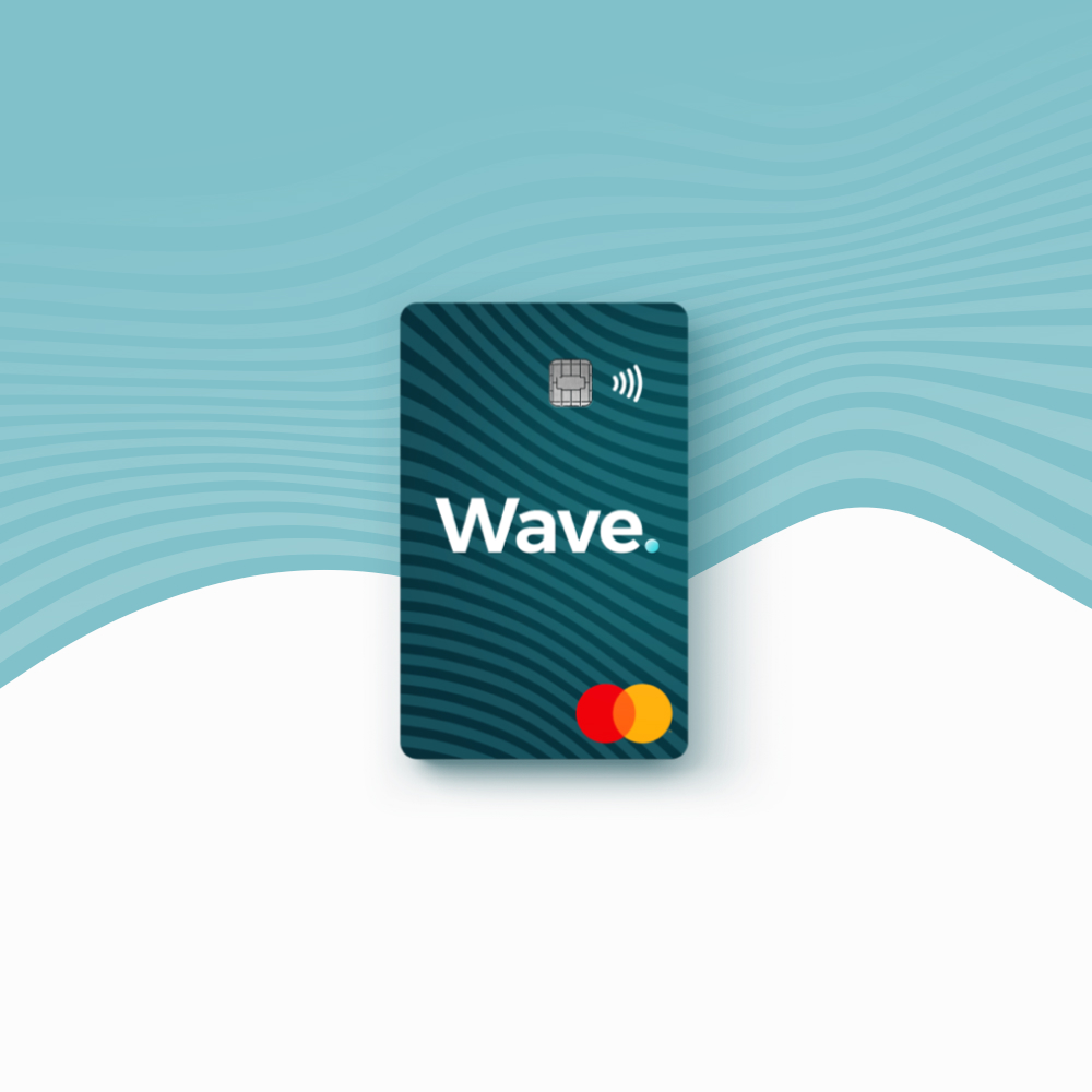
The placement of the animations were varied, from a user onboarding with Wave, to closure of an account, so that was also something that needed to be kept in mind whilst working on this.
This project was a great example of how small design touches can make a real difference to user experience. These little moments of delight helped build trust, supported brand consistency, and made the product feel that bit more special.
Challenges
One of the main challenges with this project was making sure the animations felt purposeful rather than distracting. It’s really easy for motion to tip into “novelty” territory, especially in financial products where users often just want to get things done quickly. We had to find the right balance between adding personality and respecting the user’s time and intent.
Another challenge was making sure the animations worked seamlessly across different devices and operating systems. What looks smooth on a modern phone might feel laggy or awkward on an older device, so we had to test the animations thoroughly in real conditions.
Finally, collaborating across disciplines can sometimes bring challenges too. Motion designers think differently to engineers, and engineers have to translate design intent into code that actually performs well. It took a bit of iteration, discussion, and compromise to land on animations that looked good, performed well, and felt meaningful in the flow of the app.
Exploring ideas
Before jumping straight into the hi-fidelity animation, I spent some time sketching out early ideas for how these animations might work. This wasn’t about creating polished visuals. It was about quickly exploring how different movements could support the actions users were taking in the app.
I sketched rough sequences showing how an icon might animate when completing a task, how feedback could appear, or how we might bring attention to something new. Even though these sketches were basic, they were a really useful way of thinking through the motion in a low-pressure way, without getting caught up in details too soon.

These early sketches also helped spark conversations with the wider team. Sharing rough ideas early meant we could get feedback sooner and avoid going too far down the wrong path. It also helped me think about how I was going to complete the animation inside of Keyshape.
Sketching at this stage helped keep things creative and flexible. It gave me the freedom to test lots of ideas before committing to any specific direction.
Output
The result of this project was a set of carefully crafted animations that helped the app feel smoother, more thoughtful, and more human. These were subtle touches, but they made a real difference in how polished the product felt overall.
Tool used
Keyshape
keyshapeapp.com
A couple of years ago, I was looking for an app to generate animated SVG files for my work. Previously, I have been very familiar with Adobe Flash, having used it earlier on in my career, and was hoping to find something similar. I stumbled upon Keyshape and decided to undertake the 7-day trial. I was extremely impressed with the simplicity of use, the workflow and the end product, and consistently use it whenever the need for animation arises in my workflow.

One of the biggest wins was improving the sense of feedback in key moments. For example, when a user completed a payment, a small animated tick gave that satisfying sense of completion, making the process feel clear and reassuring. These micro-interactions helped build trust, showing that the app was listening and responding.
From an implementation side, engineers were able to build the animations efficiently, with performance staying solid across devices. Accessibility also worked as intended, with animations automatically reducing for users who had that setting enabled.
Overall, this project showed that even the smallest details can have a meaningful impact on user experience. It helped strengthen the visual identity of the product, made key actions feel more rewarding, and supported that overall sense of trust and professionalism that’s so important in financial products.
Due to an issue with WordPress, I can’t seem to display the full icon range on this page. You can, however, download the icon pack here.