Overview
Managing a booking should be one of the simplest parts of booking a holiday — but for Thomas Cook Airlines, it had become a frustrating and confusing experience for many customers.
I worked on a project to redesign the Manage My Booking section with a clear goal: to help customers easily view, update and manage their holiday details without stress.
This case study walks through how I identified the pain points, collaborated with the team, and shaped a more intuitive experience that supported both user needs and business goals.
Initial thoughts
On first glance, it appears that MMB has been the neglected child for quite a while. An inspection of the JIRA board for MMB led us to believe that this was the case.
This was coupled with the fact that the only real brief was a single line uttered by the Project Manager — “Make MMB less sh*t” — so we did!
We decided that the best course of action would be a series of quick wins. Getting the MMB Dashboard into a position where it may actually be useful to the users, in a relatively short space of time, was the aim current aim.
Heuristic evaluation of the existing product
After viewing the MMB dashboard, the first thing that we noticed was that there was no real, clear place to go for the user. No call-to-actions, no immediate in-your-face opportunities for the user to interact with.
There was a large amount of space at the top of the dashboard which seemed to offer very little to the user.
Imagine that — you’ve just booked a once-in-a-lifetime trip to Las Vegas — you log in to check your booking, and you’re faced with a dashboard this barren of useful information?

The flight information was basic, with absolutely no interactivity. The iconography was a little confusing too — why are the planes going in the same direction?! Sometimes I myself, can be a stickler for the smaller details, and it’s these types of things that tend to be noticed.
Thankfully, unbeknownst to us when first taking on the project, a brand new flight information component had been designed, approved and was ready to be imported into any further design work.
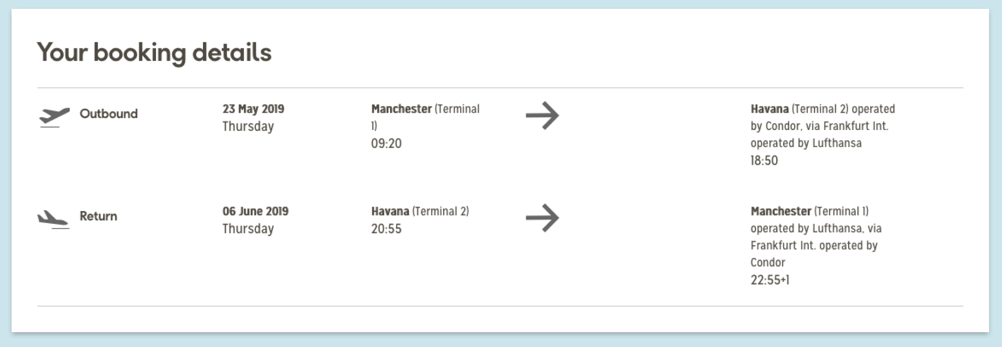
The Passenger Information section had quite a large amount of wasted space on the right-hand side of the component. This didn’t change when multiple passengers were added to a booking. On first glance, you’d be forgiven for assuming that the passengers would simply sit neatly together, next to each other. This was not the case — as the row spanned all 12 columns and duplicated below — leaving the empty space intact!
The other immediate thought was that once ancillaries were added to a booking, they would perhaps occupy the empty space? Sadly this wasn’t the case, and no matter what was tried, the space remained empty. What a waste.
The other immediate thought, was that once ancillaries were added to a booking, they would didn’t seem to change when ancillaries were added to the booking also.
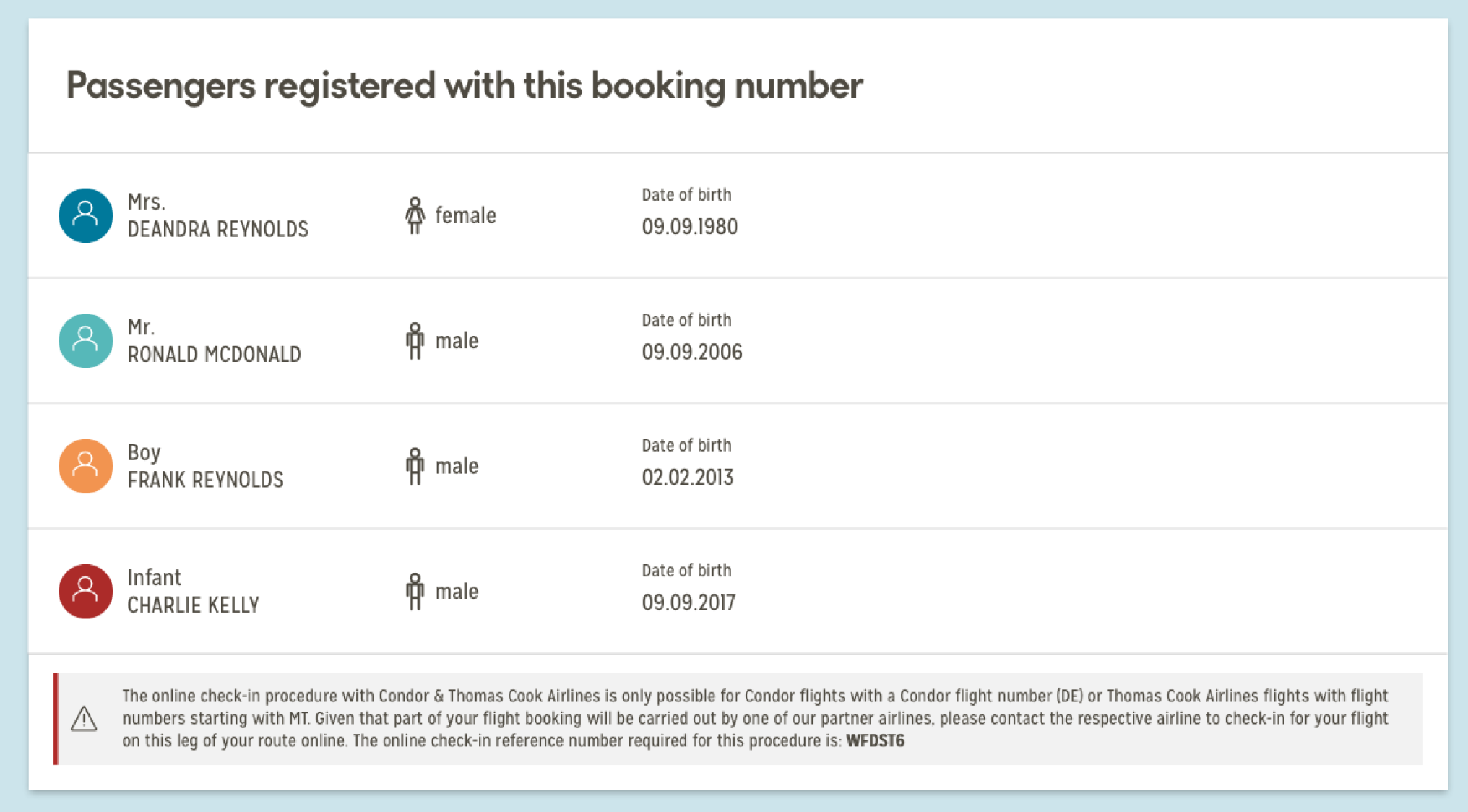
The actual prompts aimed towards interacting with the user appeared to be housed halfway down the page. The user had to scroll past all of their flight and personal information to see this. The “You May Need” to section was simply a set of hyperlinks that sent the user towards some anchor links around 800px further down the page.
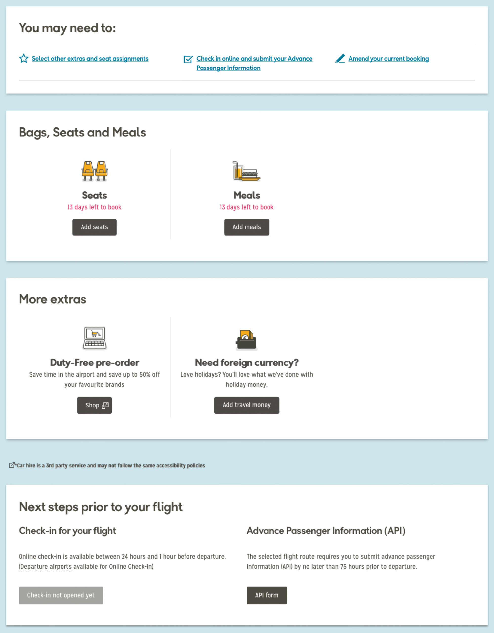
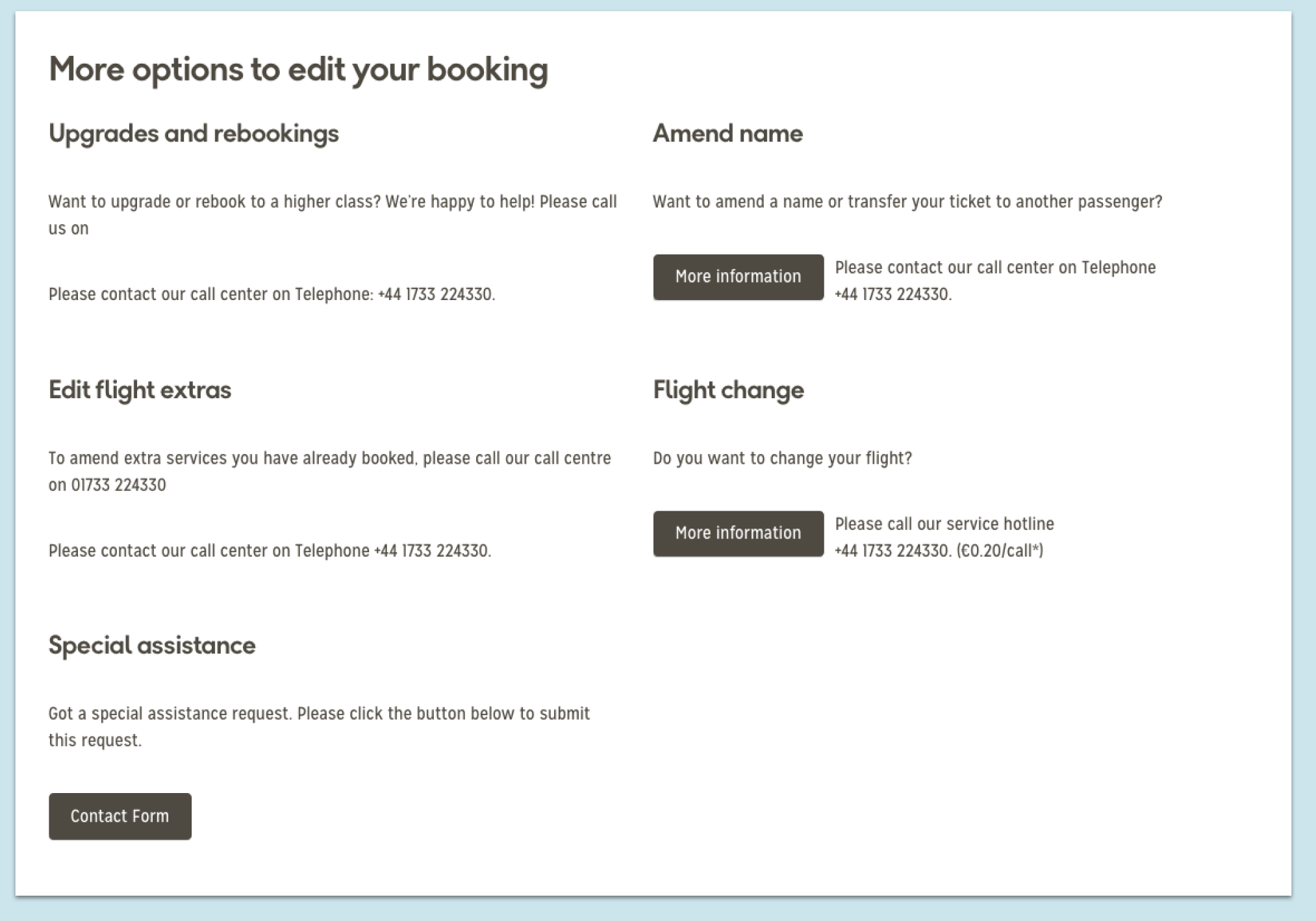
There was a large amount of information at the bottom of the dashboard, which upon first inspection appeared to give the user the option to amend their booking in a number of ways. When looked at further, it appeared that 4 (FOUR!) of the options pointed the user towards the same telephone number. One simply linked to a contact form. Some of the page design wasn’t immediately making things clear confusing users and the interaction design was exacerbating the issue.
If we could simplify the page, and tone down the interaction design, we can make the process of selecting flights more obvious and therefore lift conversion.
Initial ideas
After discussing initially as a team, and meeting further with Michael Zimmer, it was extremely obvious that more needed to be done with MMB. We needed to give the users a reason for them to come back to the MMB dashboard, as it has an extremely high exit rate, with the vast majority of users not returning at all. Also, one of the goals that were set during the initial meetings (which is brand new functionality) was to capture information from the passenger, outside of the standard APIS information which is required for the flights.
E-mail addresses and mobile/telephone numbers for all passengers was the ideal situation — this would allow TCA to send notifications to all passengers in regards to their upcoming flight.
While there are plans to expand the dashboard further and revamp it completely, we decided to settle on a series of “quick wins” that would address the main issues of the MMB dashboard.
We decided to tackle:
- Give the users an immediate focal point on the dashboard when they logged on to the page
- Move the booking number to the top right-hand side of the dashboard, taking it away from the large yellow block
- Re-design the passenger information section
- Eliminate some of the elements further down the page, thus reducing the height of the dashboard
- Display the brand new flight information section
Initial Designs
“Your next steps” component
This was designed to replace the “Next steps to your flight” section of MMB dashboard. We would be lifting it from it’s current place on the page (halfway down!) and placing it at the very top. This would replace the large yellow (seemingly pointless!) block at the top of the page, and push the content a little further down.
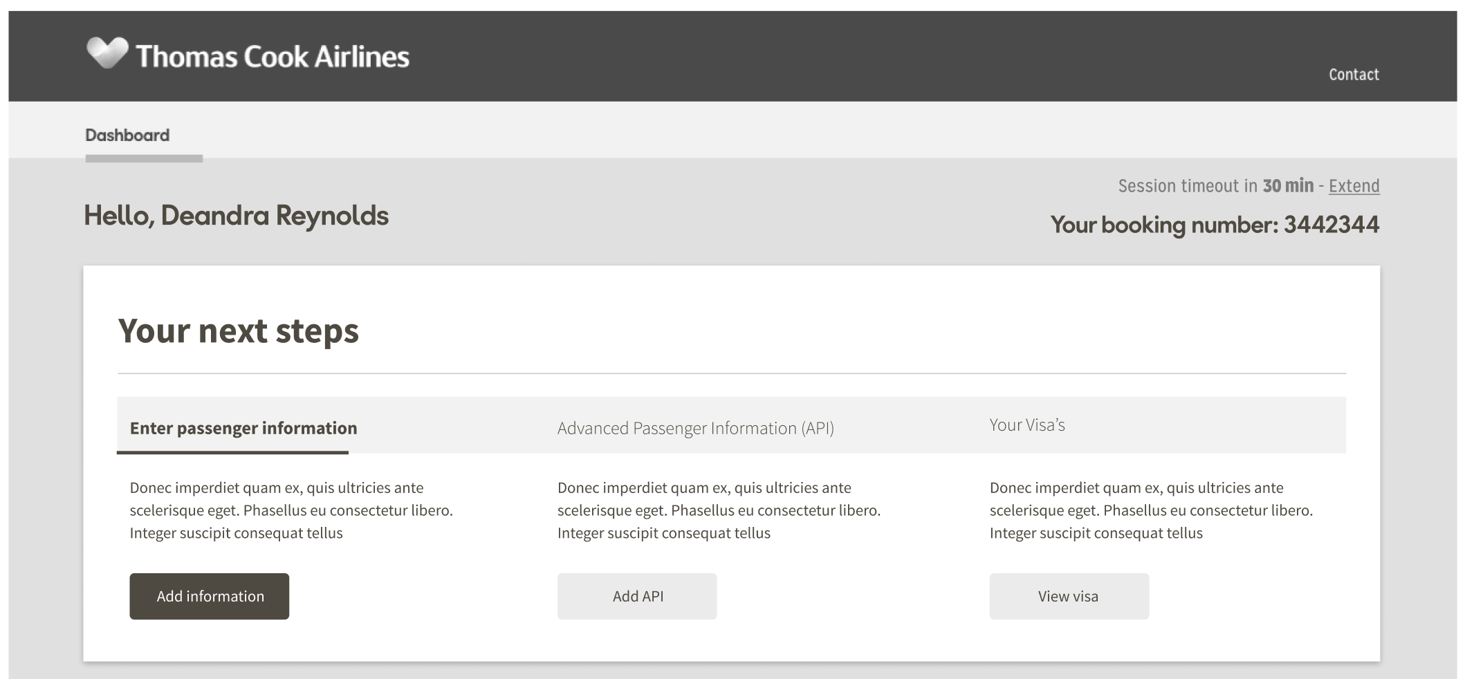
It was designed to entice the into completing the three main tasks that we identified when logging into MMB. These were:
Asking the user to enter their contact information
After speaking with the PO — one of the targets he had been tasked with by seniors (prior to my work on the project) was to gather contact details for each and every passenger on the booking, specifically their:
- Mobile phone number
- Landline number (if applicable)
- E-mail address
This would enable Thomas Cook to update the passengers immediately if anything was to change in regards to their booked flights.
This was identified as one of the main priorities.
Asking for Advanced Passenger Information (API)
One of the mandatory requirements for most flights, is the submission of Advanced Passenger Information (API). This requires the user to submit their:
- Full name (as it appears on their passport)
- Date of birth
- Gender
- Nationality
- Their passport number
- Their passport expiry date
- The country that issued their passport
- Their country of residence
When travelling to America — additional information is required:
- the address of the accommodation of your first night’s stay at the destination
- Alien Registration Number (Green Card) US residency holders
- Traveler Redress Number if you have one (this enables travellers who have experienced problems entering the US to avoid future difficulties).
This is a requirement for each and every user, and MUST be completed. It can be done at any point, including as late as checking in for your flights. We couldn’t believe that an action as important as this was placed so far down the page, and wanted to bring it further to the top, and get the user to complete the action a little quicker.
Checking/applying for any visa
By integrating Sherpa, a 3rd party product, we will help our customers discover if they need any kind of visa. As we will already have the destination, Sherpa only needs to know each passengers nationality to notify any need for a visa.
We can highlight the need for checking visa requirements with a well worded card. A CTA which triggers the Sherpa modal and journey will help users arrange for one if required.
The two journeys would be;
- If the user does not require a visa
Sherpa will highlight that a visa is not required and the user can dismiss the modal - If the user does require a visa
The user would be directed through the Sherpa process to arrange visa purchases
Functionality
After the user interacted with one of the cards at the top, the action would then be “completed” and update the relevant passenger’s information further down in the dashboard. This would result in the “completed” card disappearing from the top, and the card/cards immediately to the right of it, moving along.
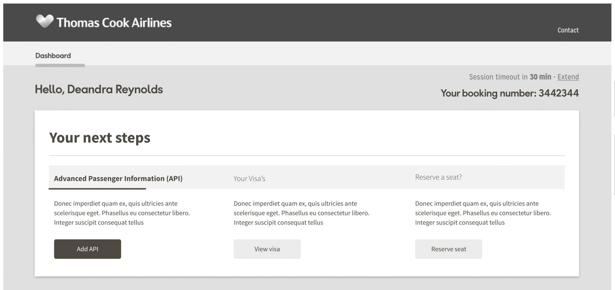
Once the mandatory cards have been completed (Passenger information, APIS & visa notification) — then the cards will be replaced by ancillary cards — up-selling seat reservations, extra luggage space, etc.
Once happy with the layout and the sizing, a hi-fidelity prototype was created and Thomas Cook Airlines branding injected into it.
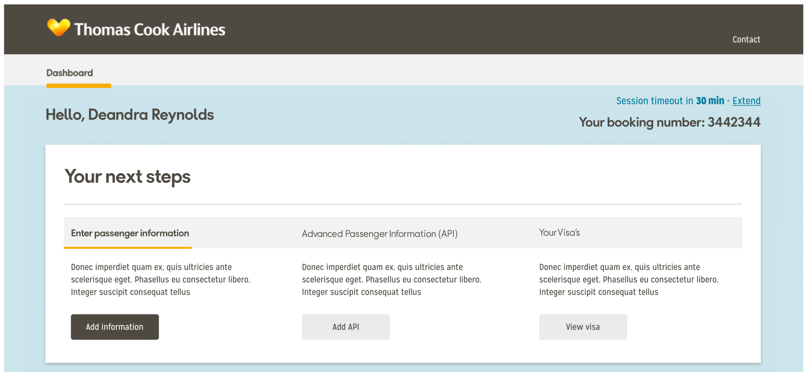
We went with the bold choice of “greying” out the buttons on the two cards that we weren’t trying to immediately draw attention to. This was purely a design choice — the functionality was intended to remain there — it was just done to create a sense of “urgency” in the user, and entice them to interact with the card immediately to the left, first. After completing the first card, the card that then replaces the completed card will be highlighted, and the others remain grey, much like the wireframe.
After hosting a show-and-tell session, multiple participants commented that they felt the greyed-out buttons looked like they were deactivated, and on first sight assumed that the buttons simply weren’t functional. We took that feedback, combined it with the new copy, and adjusted the colour scheme.
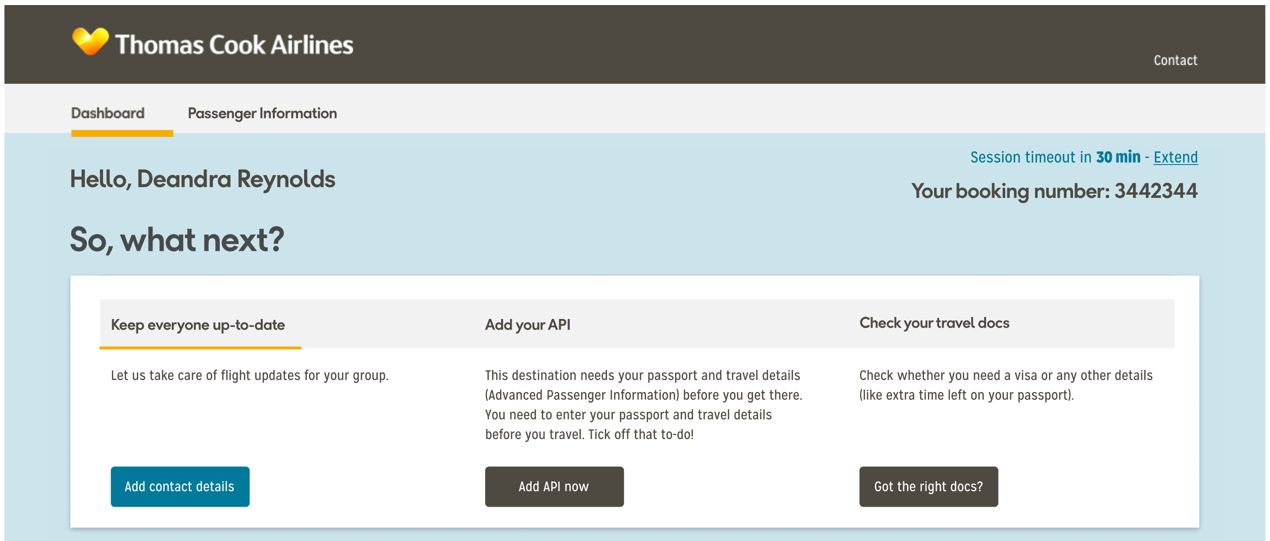
The button colours received a much better reaction from those we showed it to. The buttons no longer looked like they were not function. We also made a minor UI change — instead opting to position the title outside of the component background.
“Passenger information” section
So, now came the fun bit! How do we breathe a bit of life into a fairly standard component of the dashboard?
We took a step back, and looked at what the component was offering us. Lets be honest — not much. It reminded us of the passengers names, their gender, and age. That was it.
A dashboard should be a vault of information on the trip, especially where multiple passengers are concerned, and this had absolutely nothing. It made us ask multiple different questions:
“Where was the information that was relevant to each individual passenger on the flight?”
“Charlie likes to be in the aisle — is one of us in the aisle so we can swap?”
“Frank is a fussy eater and won’t snack on the plane — did I order him a meal?”
“Damn, I didn’t order MY food — how can I add a meal on?”
“First thing I’d do on this page is probably click on the passenger info tab. I want to see the entire booking details”
“Ronald ALWAYS overpacks for trips — did I get extra baggage?”
All of these are things that we wanted to address, and display in a clear way to the user. A simple and easy way for those logging in to see what is allocated to whom, with the option to add something else, if they wished.
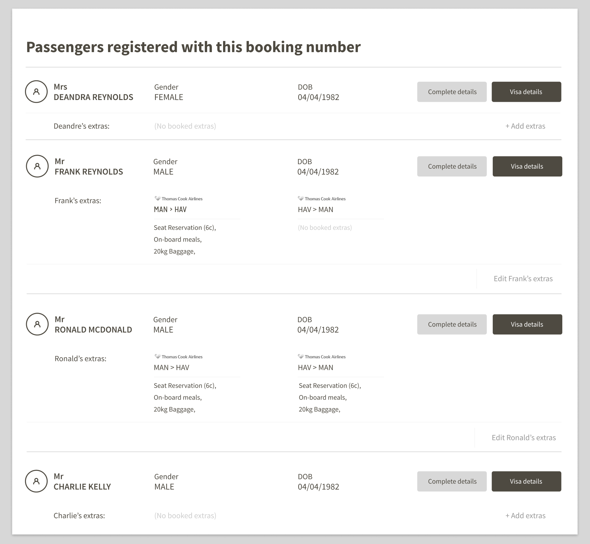
We also decided to add in some buttons that ties is with the “Your next steps” section. When a user submits their information for the text alerts, it will update button prompt in the passenger section.
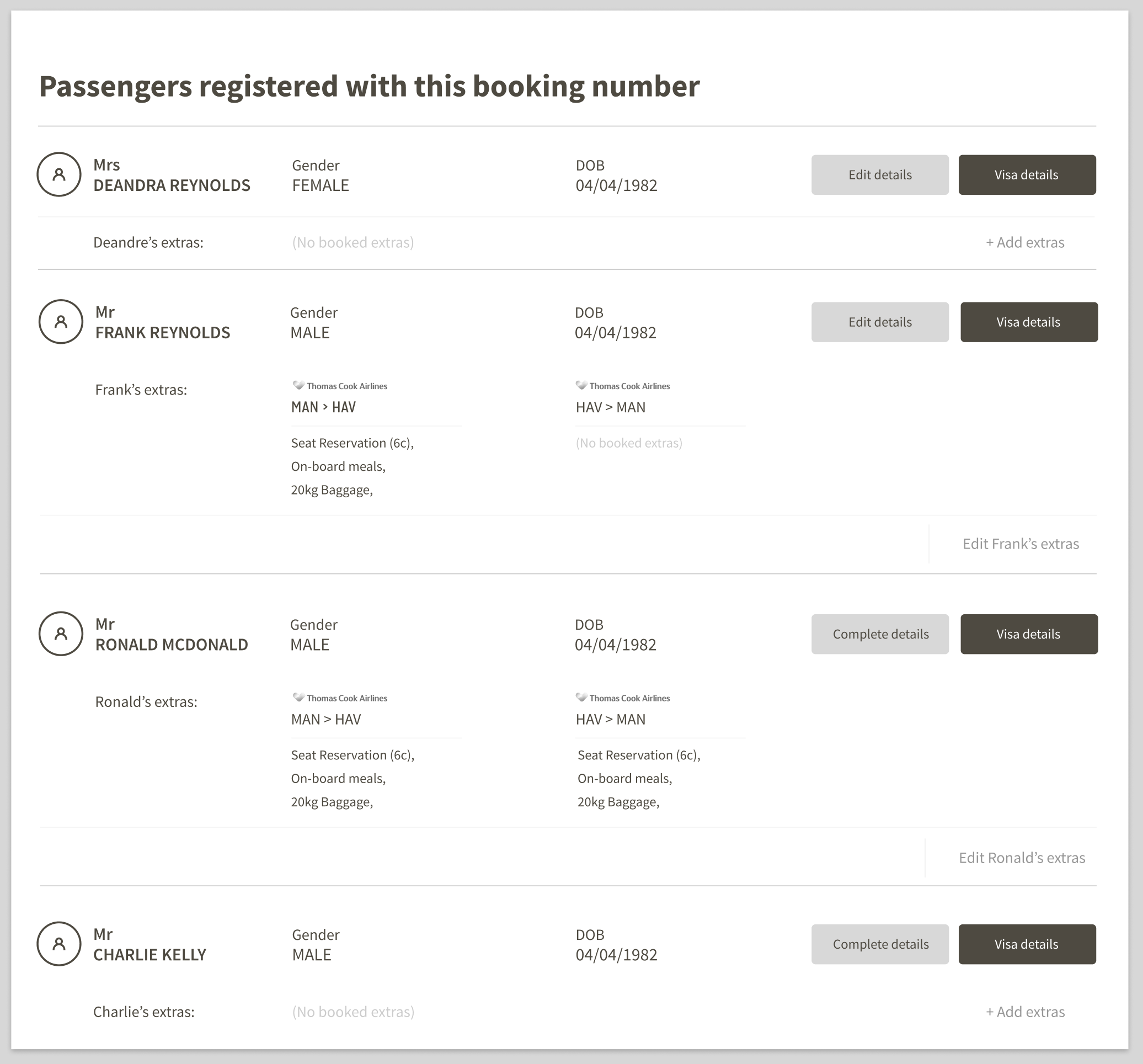
In the same show-and-tell session we received the feedback for the “Next steps” component — we also received a few comments in regards to this section.
The initial premise went down well, however there were a few things raised that could’ve been improved, such as:
- Better call-to-action prompts to entice the user
- Inclusion of APIS
- Repositioning the “+ Add extras” button
- Repositioning the buttons
- An addition of an “Edit” button
We re-worked the original design to action the points raised during the session.
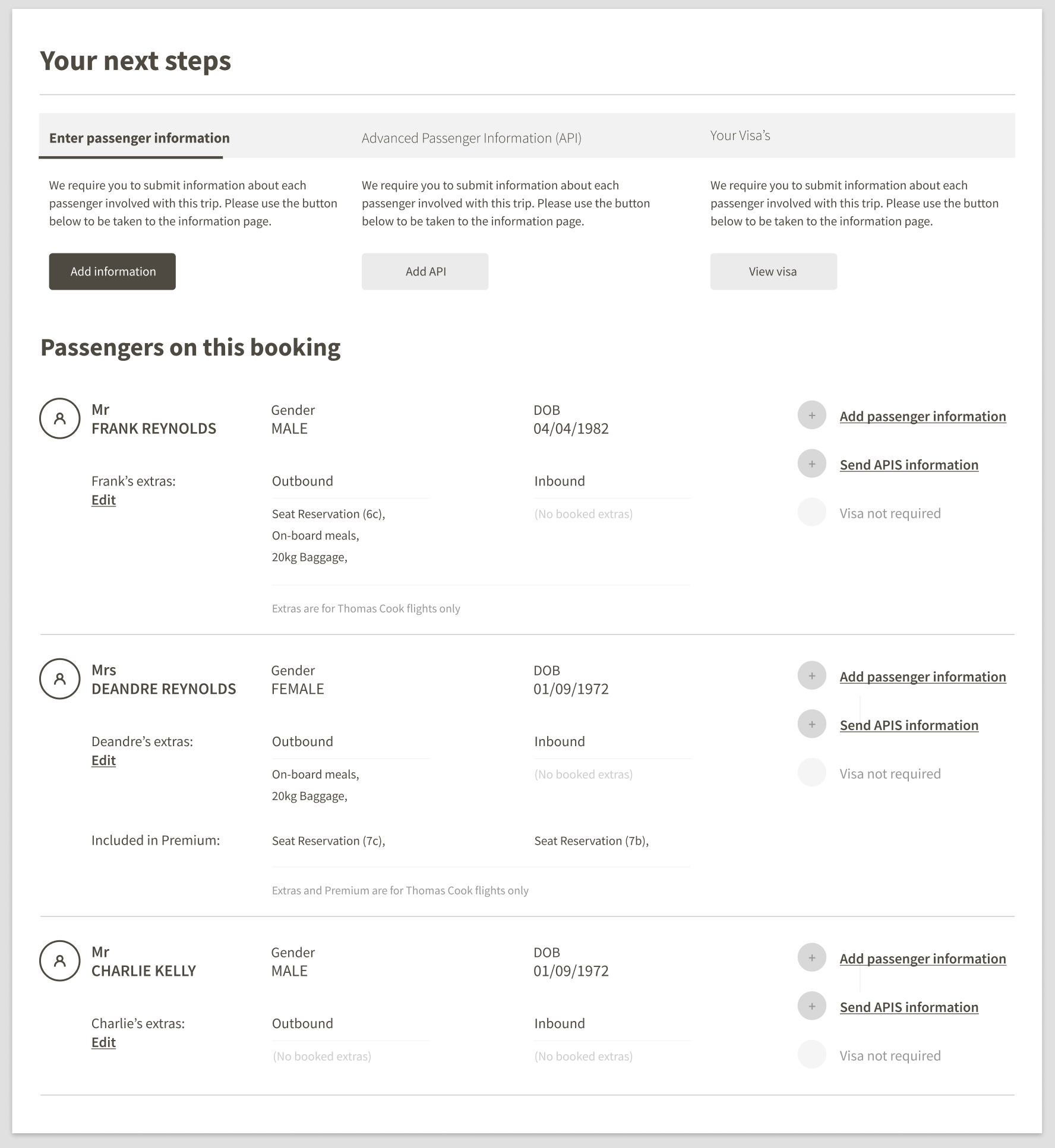
This iteration received a much more positive reaction. We decided to move forward with this wireframe, and create a hi-fidelity prototype. The title was also brought outside of the white component background, much like the “Your next steps” section.
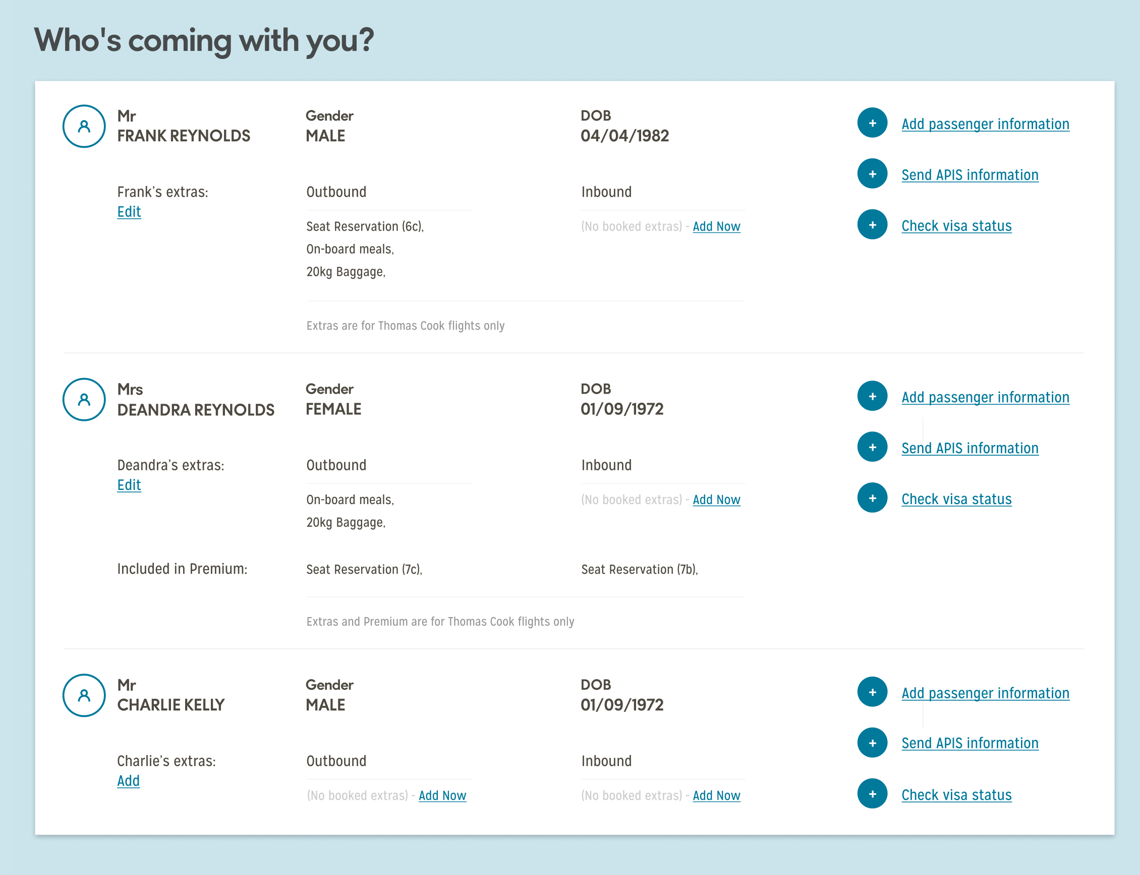
Each of the call-to-actions on the right-hand side have multiple states, which change when interacted with the respective element at the top of the page.


At this point, we felt the dashboard updates were in a very good place. We had achieved what we set out to address, and we were ready to send it for user testing.
Further updates
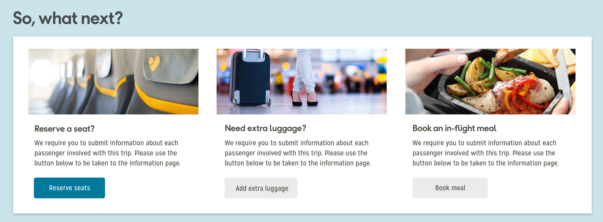
Image-based “So, what’s next?” card
The image-based card is intended to populate the “So, what next?” section once all of the mandatory cards have been actioned.
Submission notification
We decided to add in a notification that relayed back to the user that the relevant card had been filled in.

Next steps
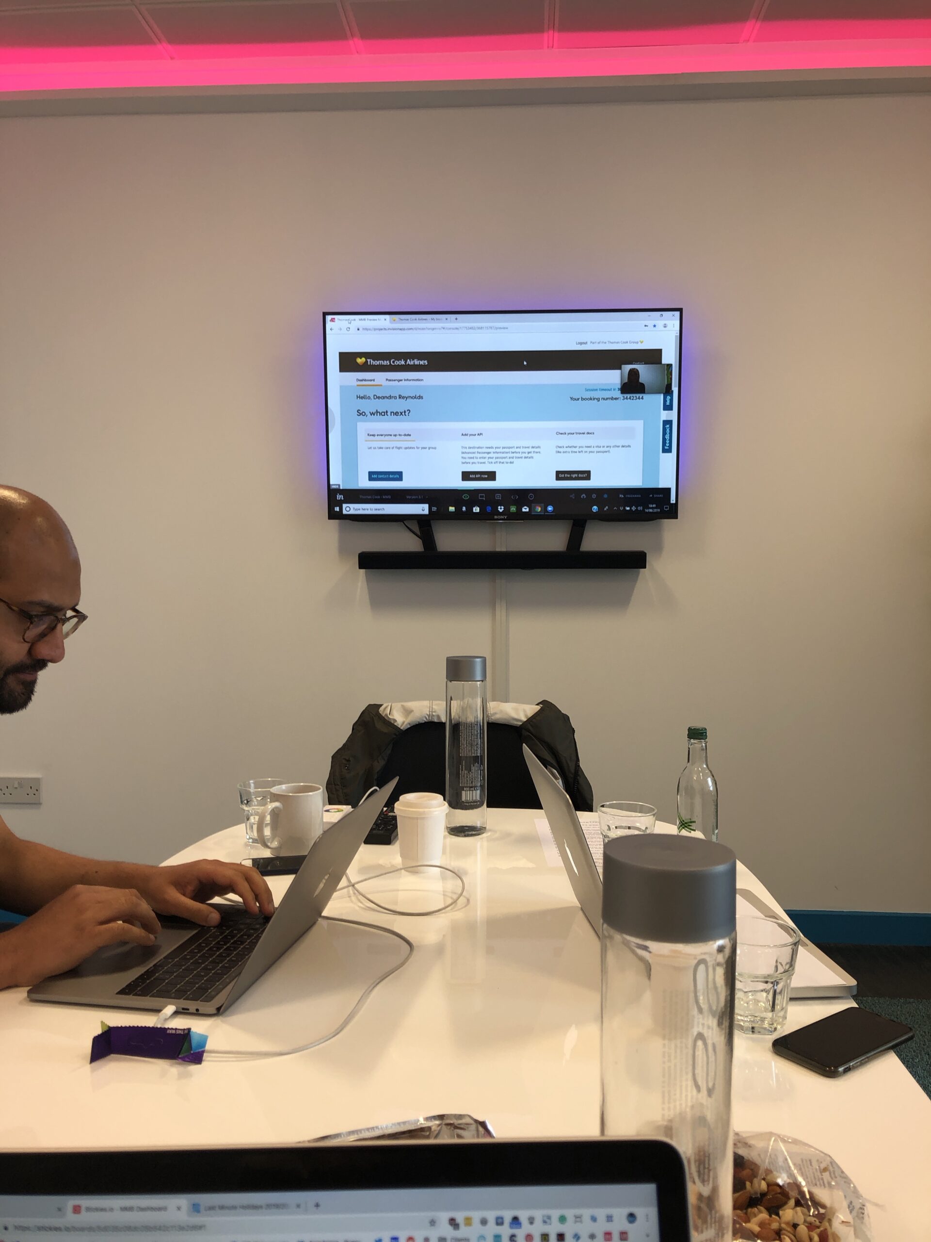
The prototype was uploaded to Invision, and on Friday 14th June, went to user testing at Keep It Usable in Media City.
Next steps
The prototype was uploaded to Invision, and on Friday 14th June, went to user testing at Keep It Usable in Media City.
Overall, the feedback was positive amongst the tested users, and the prototype seemed to perform well. The main takeaways were:
New dashboard design
- User would scroll and double-check all the details were correct. Sense-checking the information is correct (times, details)
“First thing I’d do on this page is probably click on the passenger info tab. I want to see the entire booking details”
- Have I got the right documents?
- Purpose is to add information, book extras, etc
Component bar
- Saw the bar as a tick-off list
“Keep everyone up to date — that’s a good idea”
- Instinctively went to add details, complete APIS
“I’m adding details that TC don’t have”
- Current dashboard design
Liked
- Liked the terminal information
- Preferred the current visual design, but not the information
- Images — makes it brighter, more appealing
- One participant in particular loved Airshoppen
Disliked
- Copy, layout, feels confusing
- Not sure what to do next
- Things I need to do should be higher
- Assumed everything had been completed
- Thought it was a summary page — not something you interact with
Image-led tabs
- Preferred the image led ancillaries over current design cards
- Should have pricing
- Would these open up a price list?
- Once mandatory tasks are complete user would like to see cards advertising things like transfers, etc.
- User expects to see tabs advertising seat upgrades, leg room, etc
- If the ancillaries were a “sensible amount” then the passenger would consider upgrading. If not, then she’d prefer to “suffer in silence”
Overall feedback
- Prefers new design — feels clearer, knowing you have to do tasks, and ability to complete things
- Something bright and straightforward — something that tells me what I have to do. “You know what to do and how to do it.”
- Be up front about what food is available and cost of extras
Refining the “What’s Next” component
After the user research session mid-June, we created hi-fidelity design variations of the What’s next component. We decided to explore different, and unique variations, to essential cover all bases in terms of UI design.
Icon-led cards
Building on the positive feedback from the user testing session — we decided to explore the card concept further. We wanted to come up with a few different variations of initial designs and refine them further.
One of the first ones we decided to try, was to bring the three different “actions” out of the white 12-column row and give them their own individual <section> elements. This means that they would be completely separate, and more “card” like.
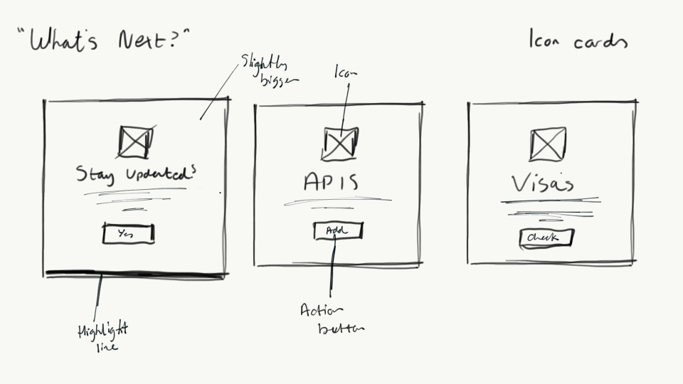
Each card would be more similar to a 4:3 ratio in shape, stopping just a few 10s of pixels short of being completely square.
The title would be in a larger font than the initial concepts, with the supporting text keeping a similar size. The text would be centred both horizontally and vertically within the card, with the button to complete the action position underneath.
The button and text would have a supporting line icon, keeping on-brand with the Runway guidelines, placed above, almost in direct contrast to the button.
The first card on the dashboard will be slightly bigger, with a thin border on the bottom — trying to provoke a sense of hierarchy to the user.
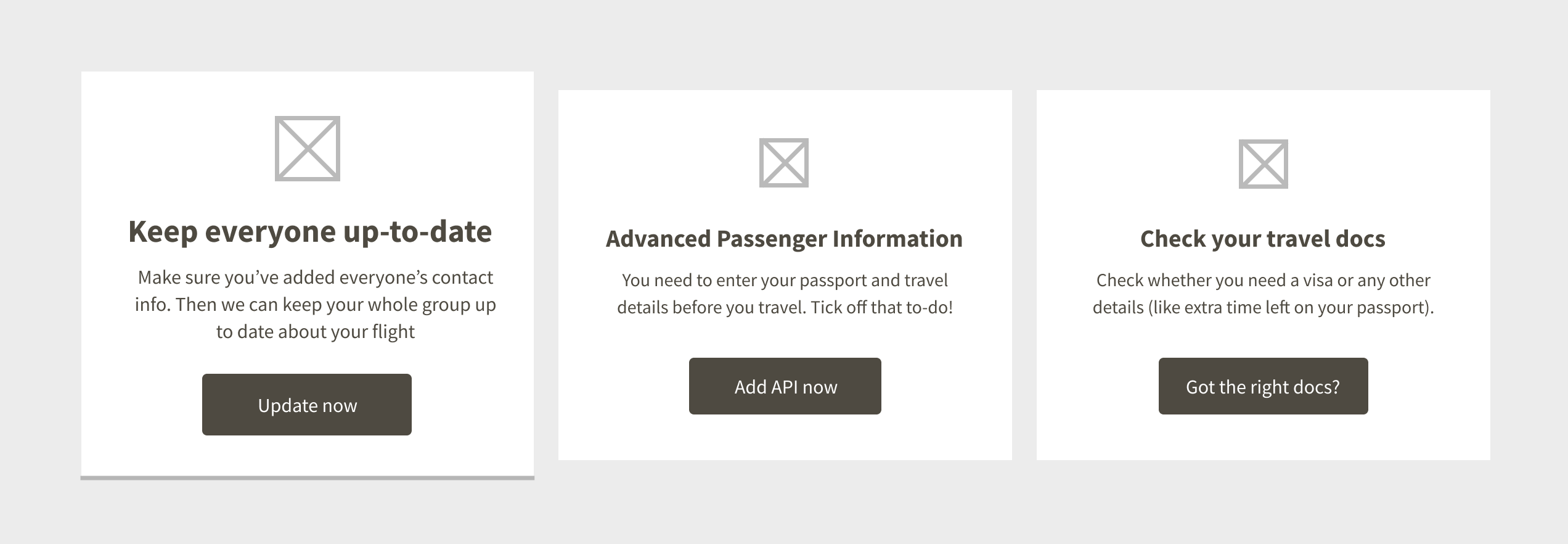
As can be seen, the cards are a lot more “independent” than the first version we tested. The functionality would remain the same however, and after one card had been completed, the cards would shift along, and the one next in line would occupy the space.
The “highlighted” card state, would always remain and would be replaced by the card immediately to it’s right.
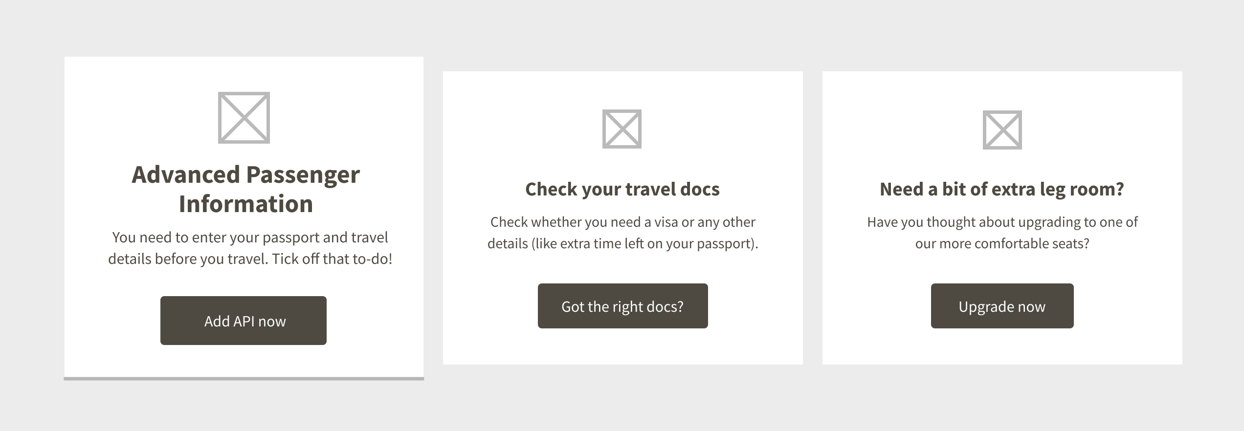
The APIS card has now occupied the first card, due to that step being completed, the third card is now the second, and the third is now an ancillary card — promoting the up-selling of seats.
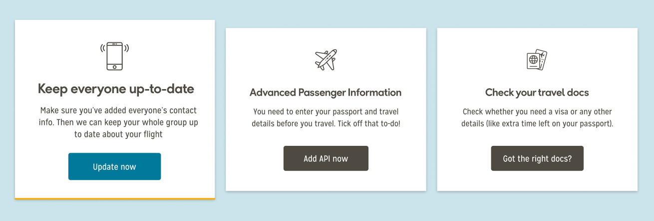
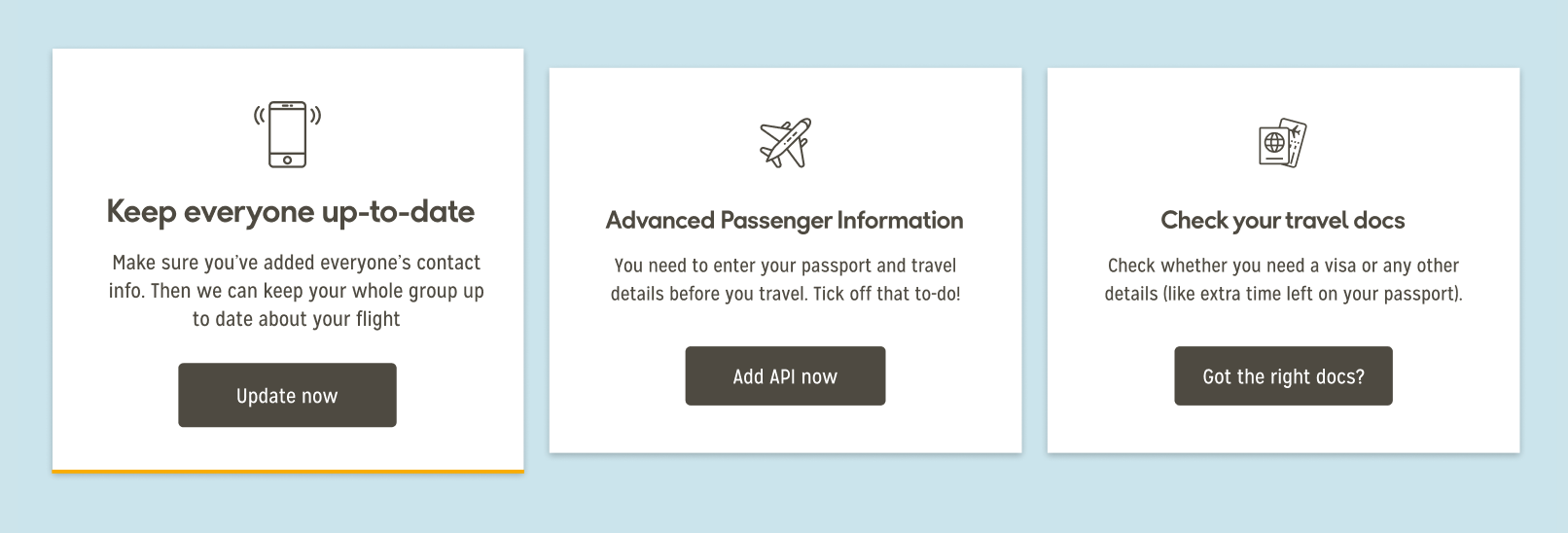
While the initially branded card could be seen as a little more visually appealing, we discovered during the user testing that some participants assumed that the card had been completed (after specifically referencing the button colour) — and instead opted for the “Advanced Passenger Information” card — skipping the first one all-together.
We decided to make all of the buttons the same colour to try and avoid this particular pattern occurring again.
Numbered variations
As an alternative, we decided to include a series of numbers on to the cards, just to reinforce the order that we intended to convey to the user.
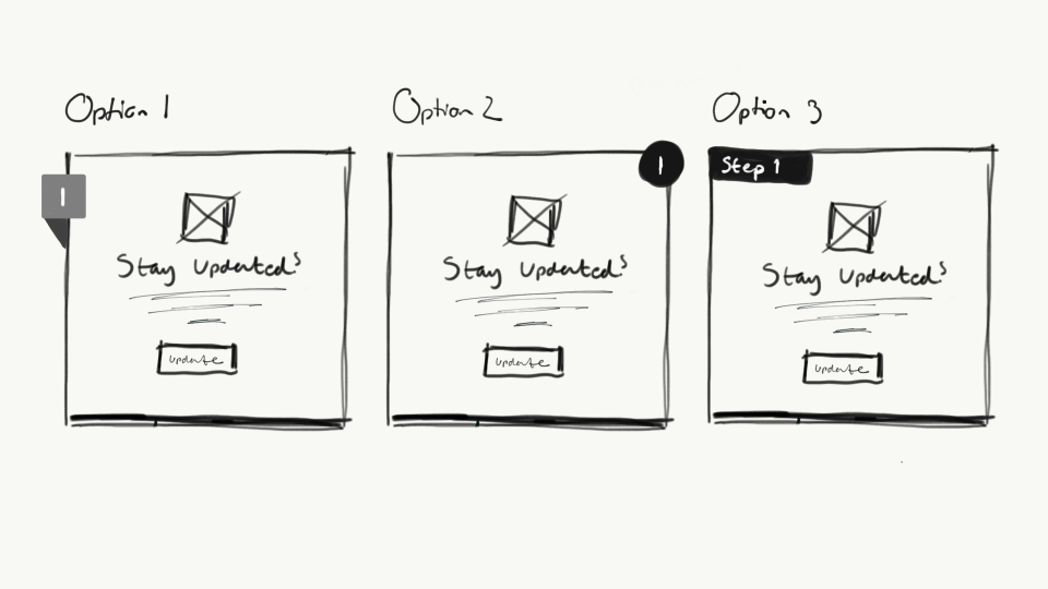
We settled on Option 1, as we felt it was the most effective. The
Option 2, we felt may have looked too much like a “Close” button — especially on iOS — this was backed up when colleagues were asked for quick feedback. Number 3 wasn’t a popular choice either.

It remains almost intact to the other designs, just with the added numbering at the top of the cards.
Image-led cards
Once again we went with the card-based format, only this time instead of the line icons, we explored the idea of using strong imagery related to whichever action we were urging the user to do.
The card size was changed to be a slightly more “rectangular” format so that the image could be displayed in more of a 16:9 format. We felt that this may be a good option, as Thomas Cook possessed a large range of bright, vibrant and appealing imagery, which we could match with the relevant action.
Button variation sketches
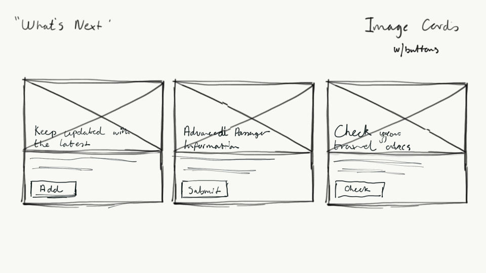
Initially, we decided to go with a button approach for the call-to-action, as we felt that this would allow us to use the brand colours successfully, and would stand out more to the user.
However after speaking with the Product Owner, he was experimenting with text links whilst in the middle of creating the Design System, so we decided to explore that option.
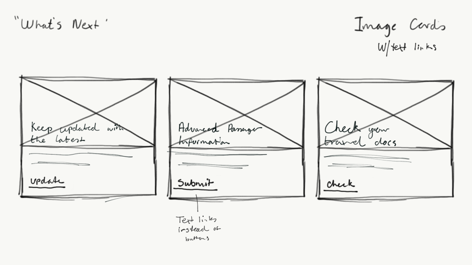
Initially, this was the favourite card, as we felt the balance between the image, text and the colour was very strong.
Wireframes
We produced the wireframes in accoradance with the initial sketches, and couldn’t wait to move on to the hi-fidelity concept.


Hi-fidelity
Scouring the Thomas Cook image archive, we debilitated long and hard with the Product Owner and copywriting team about what we should use, eventually settling on the images below.


After this, we decided to think a little more out of the box.
Checklist idea
One of the insights we gained when doing the initial testing, was that one or two users wanted kind-of a checklist-style component, so we set about creating one.
Sketches
The idea would be that the top of the page would be split. one-third would be the checklist component, and the other two-thirds could be open for exploration. Initial thoughts would be 3rd party advertisement (satisfying stakeholders whose concerns were based around revenue) or up-selling to the users.
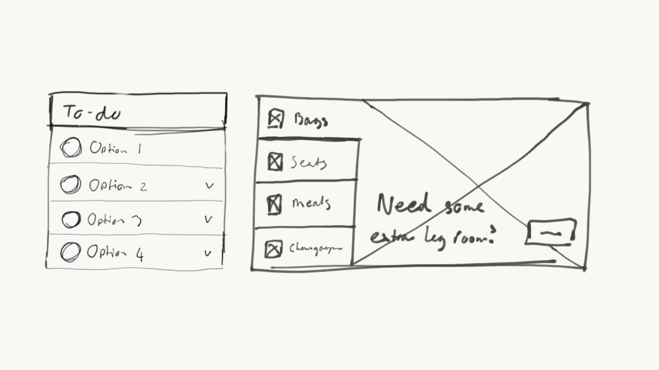
You can see here on the left-hand side, the user is prompted to complete a series of actions (TBD at this stage) — while on the right, they are able to add bags, seats, meals and champagne to the booking.
In terms of functionality, the user would click one of the options, which would then expand the row to “take over” the checklist section.
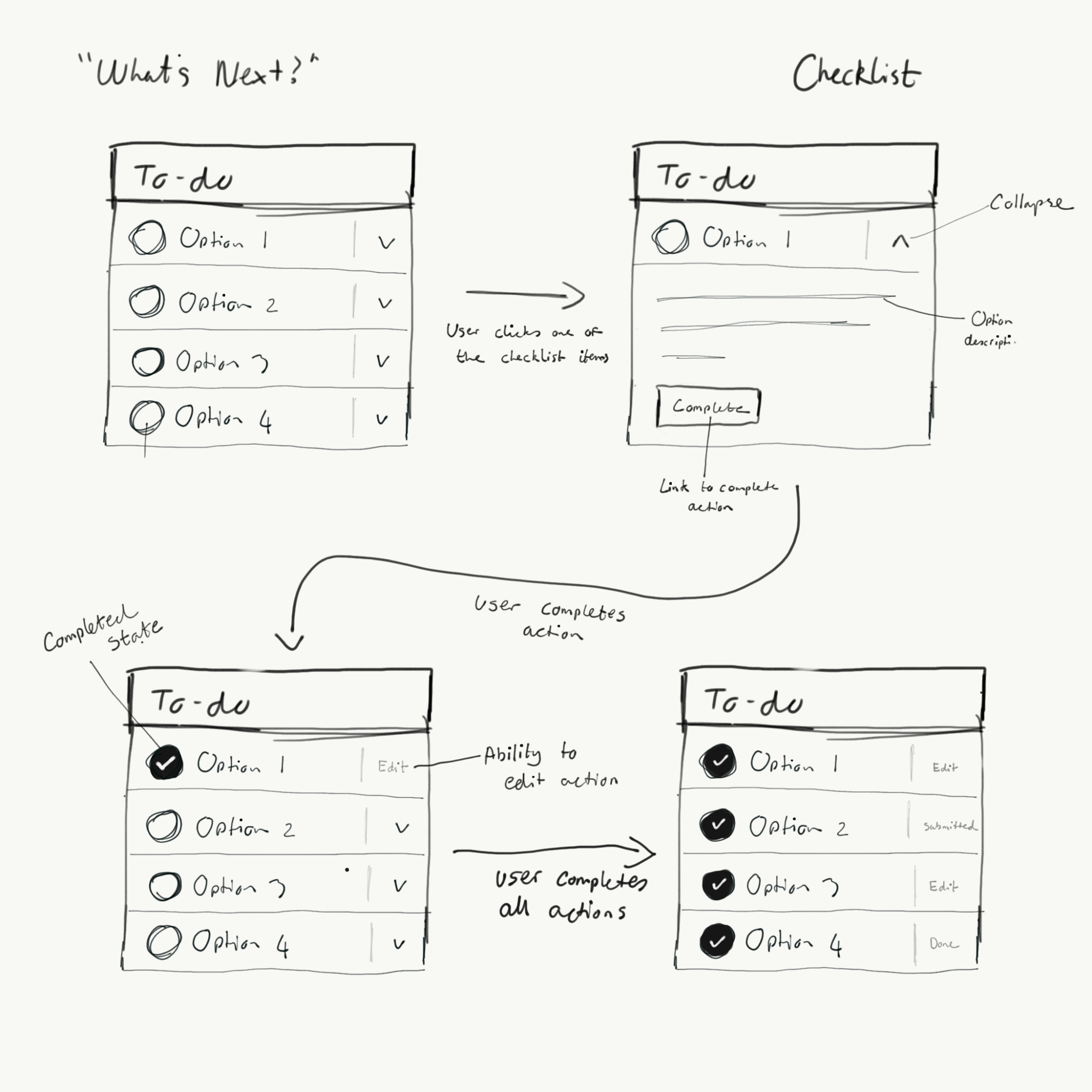
There will be a description to inform the user as to what they need to do, as well as a button to prompt the user into completing the action.
After the action has been completed, the checklist will then be updated to represent a “completed” state — which gives the user the option to edit the action, if applicable.
Successful completion of the tasks would produce a list of “completed” states, and hopefully give the user a sense of relaxation when viewing the booking.
We liased with the relevant teams, and decided the four actions we wanted to prompt the user into undertaking was:
- Supplying contact details for travel updates
- Advanced Passenger Information
- Checking for any relevant travel documents
- Retrieving the boarding pass for the users
Anything extra, such as upgrades or car rental, would be displayed in the second part of the screen.
Wireframes
After this, the sketches were then turned into wireframes.


Hmm — it looks pretty uninspiring doesn’t it?
We know branding and iconography were key, but were at least hopeful of something that looked a little better than that, at this stage! It was now going to be crucial.
Hi-fidelity
During the design of the hi-fidelity component, a few things were added on the fly, such as the “Required” tag for the API, and the “Open in 3 days” tag for the boarding passes.

It just helped the design feel a little less “empty” and helped balance the colour a little more.
The “open” state was then created — which I hated. It looked bare. Absolute crap.
There was no way we were going to get enough copy to occupy that space for all four sections — certainly not without waffling on.


Even the completed state didn’t look good. It needed to change. I was in no way happy with it, and certainly would not be asking for anyone’s opinion on this, as I myself had enough to say about it.
Internal feedback
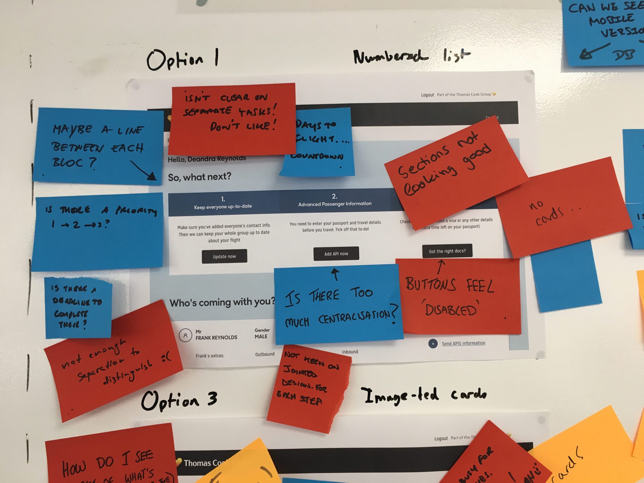
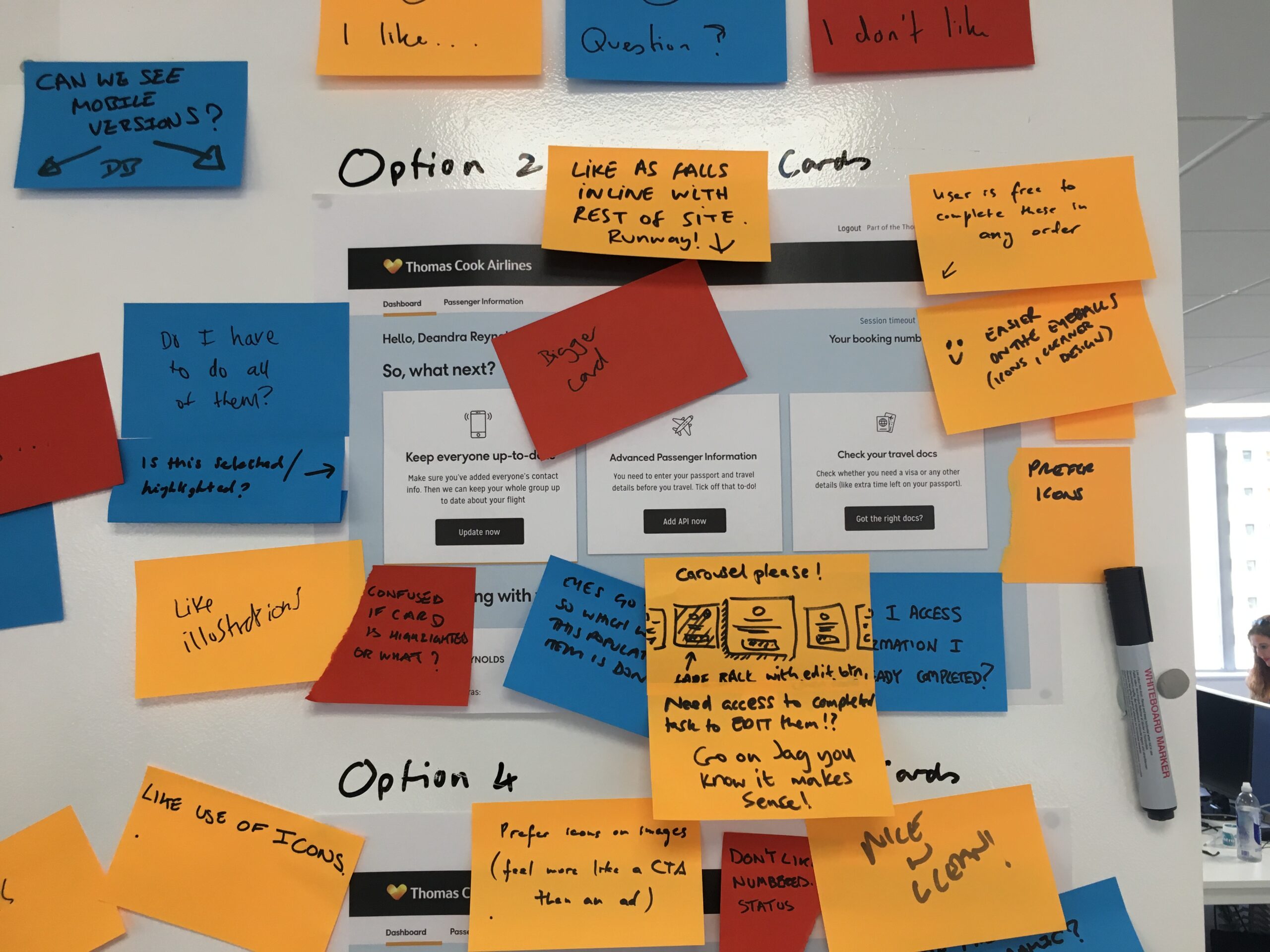
Our aim was to allow our peers to critique our work, highlight our work to other aspects of the business, and gain insights that we may have been unaware of. We also did not want to test all our variations and hoped the feedback would guide us towards the best designs.
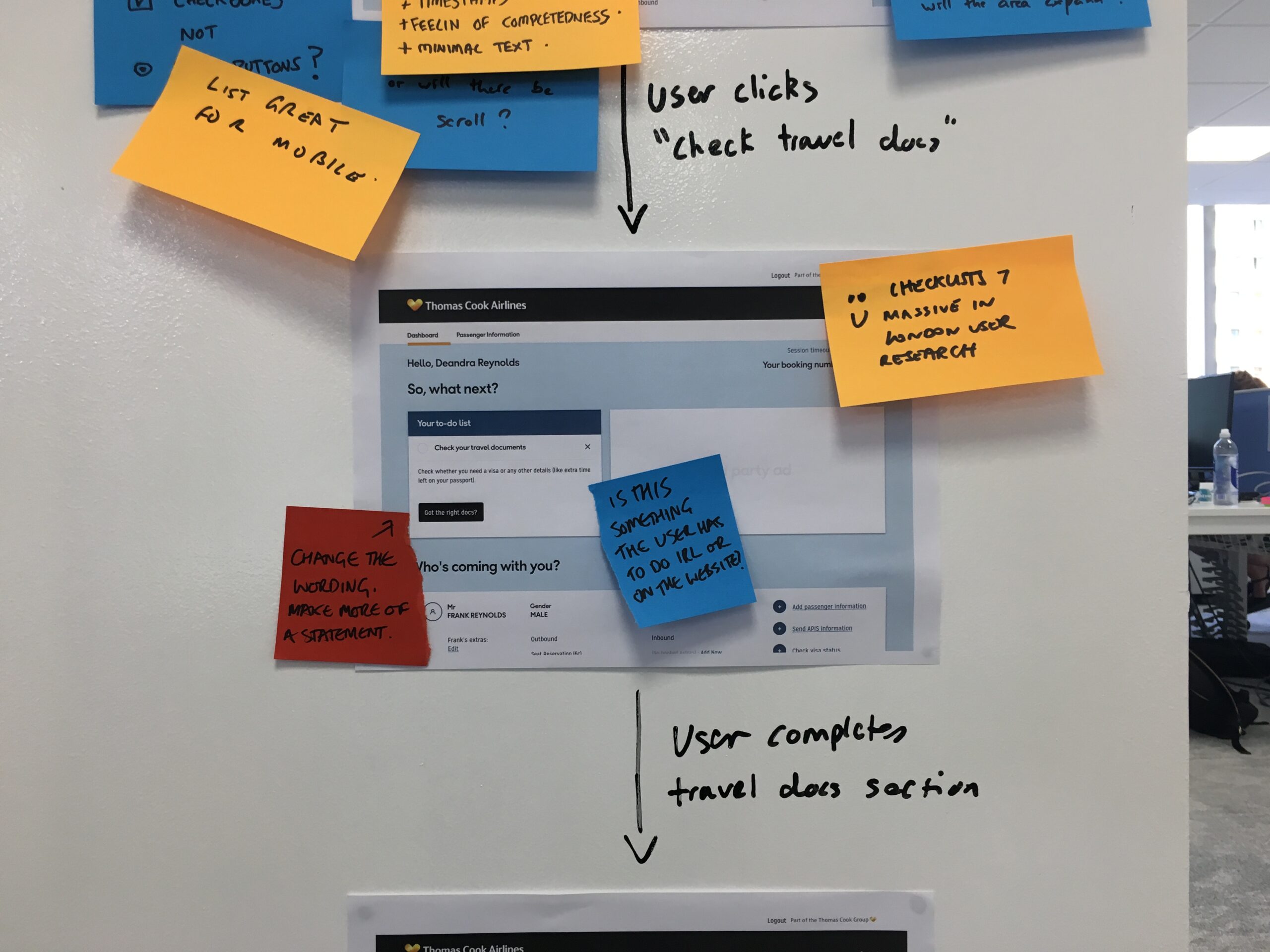
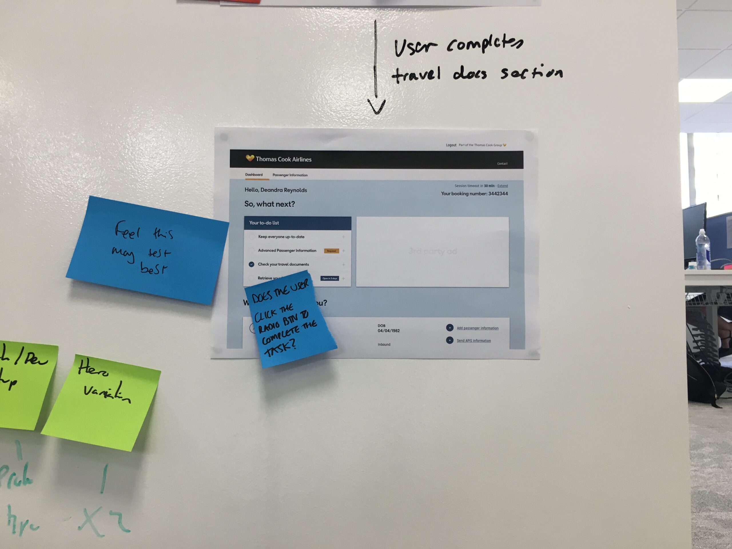
We printed and stuck our work onto the MMB whiteboard space and invited our colleagues to comment anonymously as well as making ourselves available for questions. We asked colleagues to use post-it notes to communicate feedback.
Red post-it notes would indicate a criticism
Orange would be a positive comment
Blue would be a question
As you can see, the designs gathered a lot of attention.
Option 1
Option 2
Option 3
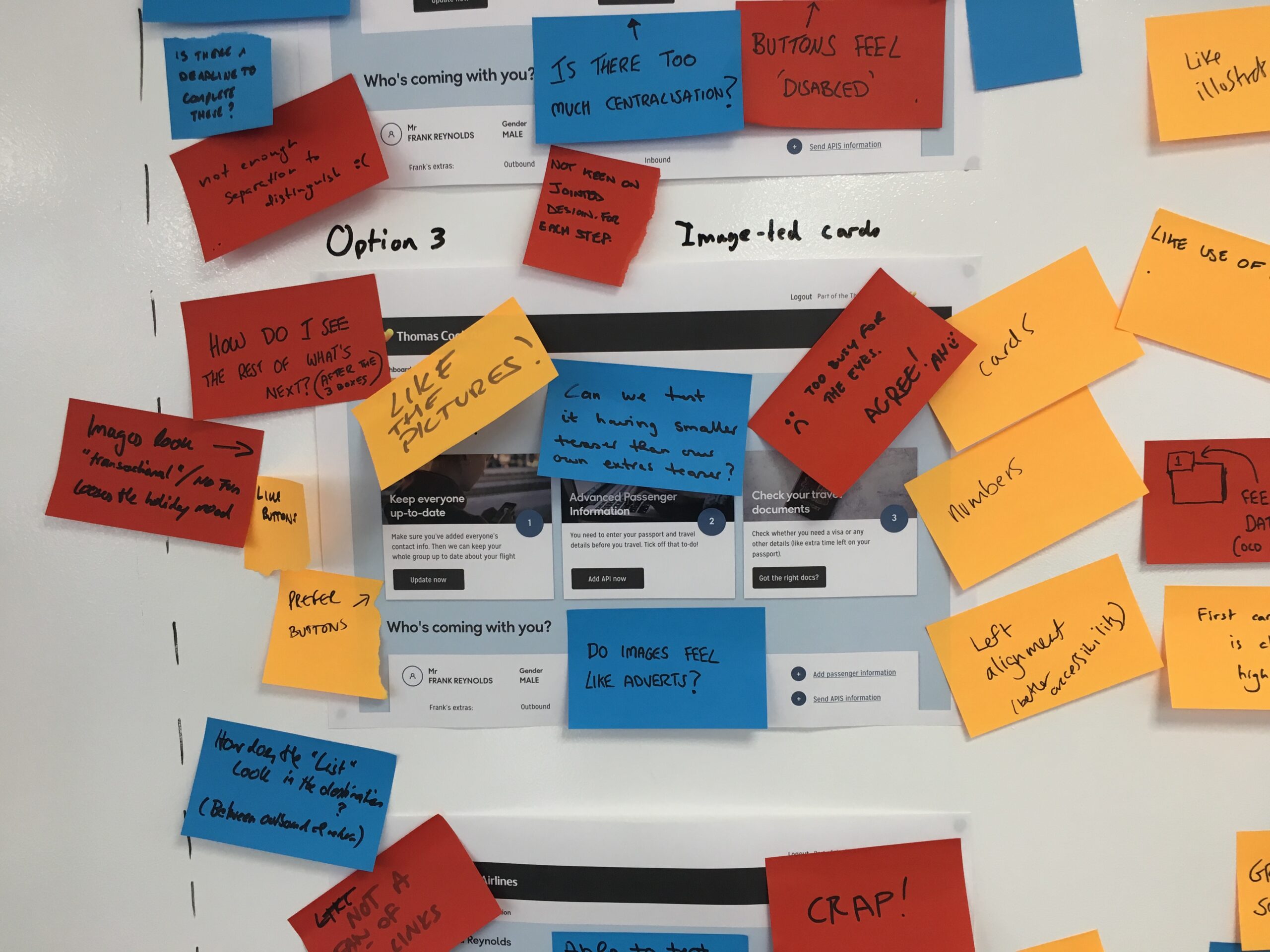
Option 4
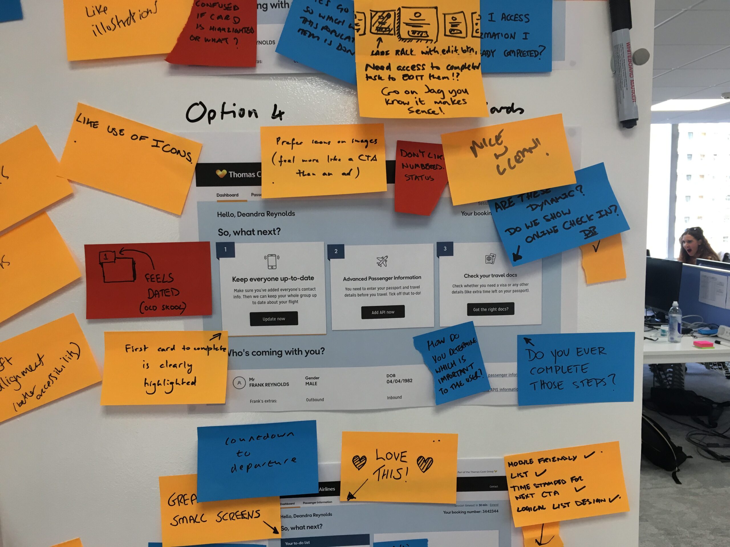
Option 5
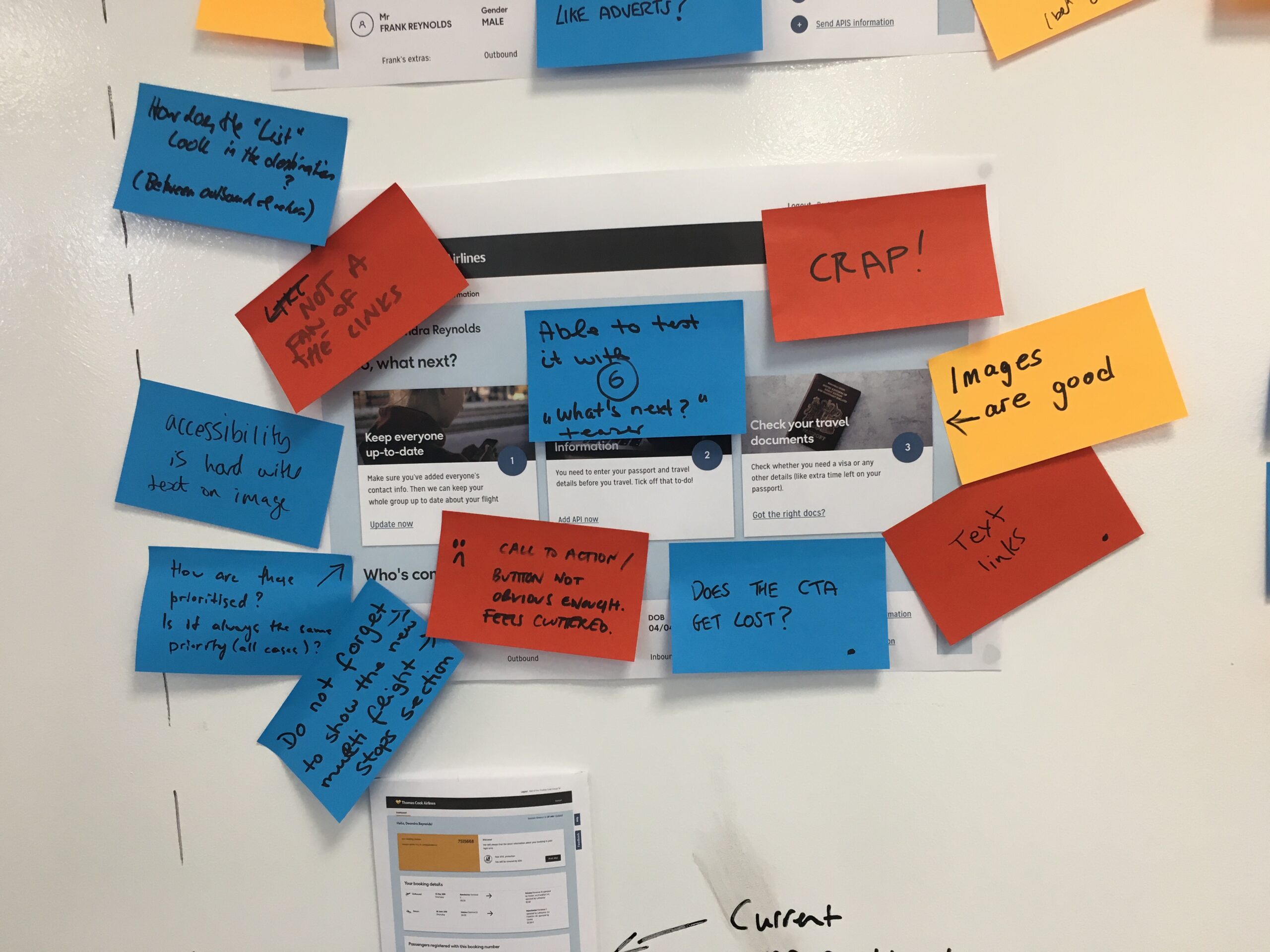
Option 6a
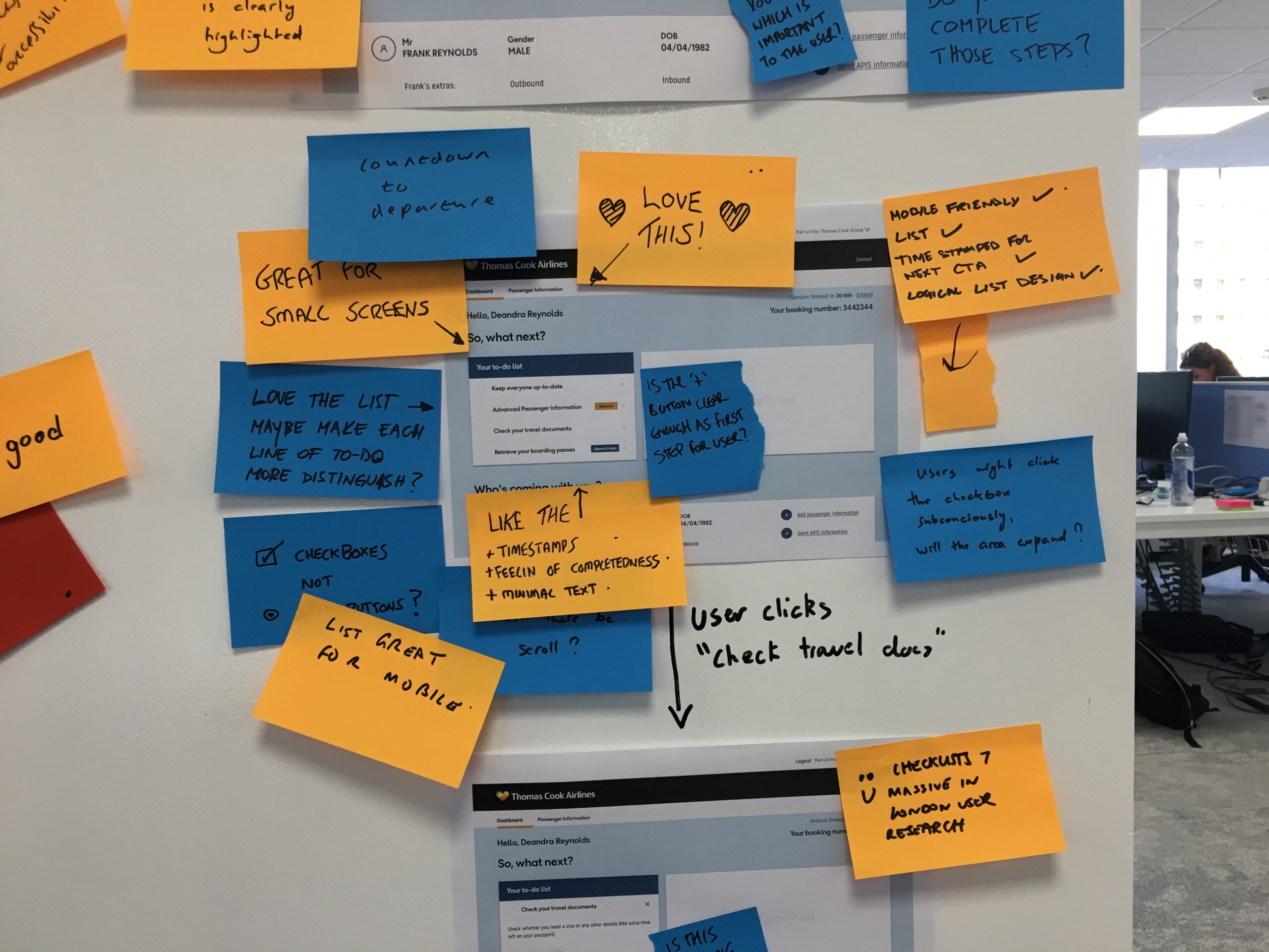
Option 6b
Option 6c
Passenger Information
After working heavily on the “What’s next?” component — we decided to focus our attention on the passenger information section.
It’s be a bit of a long read, so to refresh your memory — this is the passenger information section.

We wanted to build on this to be a useful component, that would actually be an asset to the MMB dashboard section. The feedback received from the show-and-tell sessions, as well as the user testing, led us to believe that we were on the right track.
We had included certain functionality that ties in nicely with the “What’s next?” section — but it could be better.
Sadly we didn’t have enough time to design, test and refine as many different options as the “What’s next?” section — so it was decided I’d come up with one idea, and do slightly different variations of it.
Sketching
As I was brainstorming ideas, I remembered a component in the Search & Book journey that I liked out, and stood out to me.

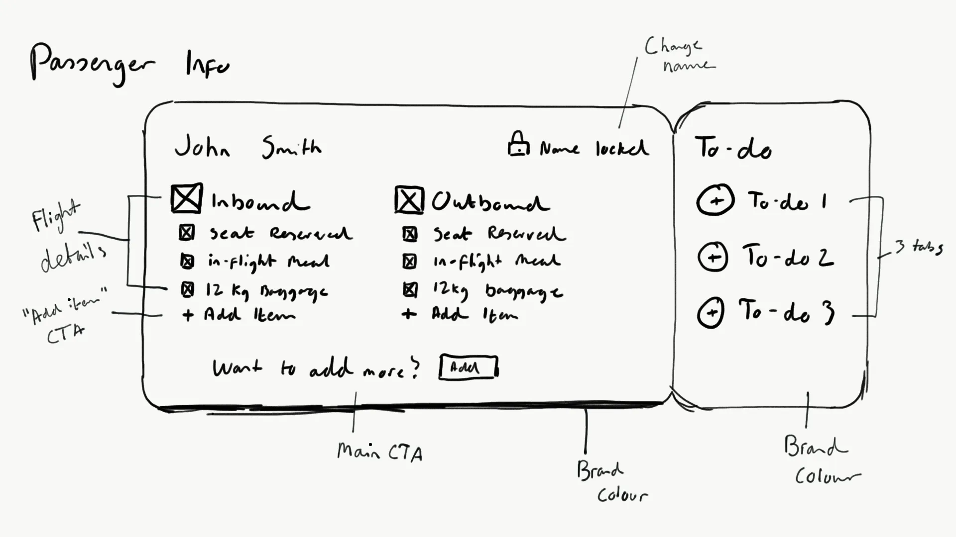
As can be seen in the sketch — the component certainly reflects a certain “ticket-like” look. The idea was to have the to-do’s (those in the “What’s next” section on the right-hand) which would be actionable, and also change when certain actions have been performed, much like before.
Pretty much the same functionality had been carried over, along with the proposal that we display to users clearly just what additional extras were attached to which flights.
In the sketch, you can see that both the inbound and outbound flights clearly states the passenger has a 12kg luggage and in-flight meals — something which was not reflected in the old dashboard.
The passenger also has the ability to change their names, which was a feature that was in the development pipeline upon my arrival at Thomas Cook, and was just about ready to go live.
Wireframe
The sketch was converted into a wireframe and tweaked ever so slightly.
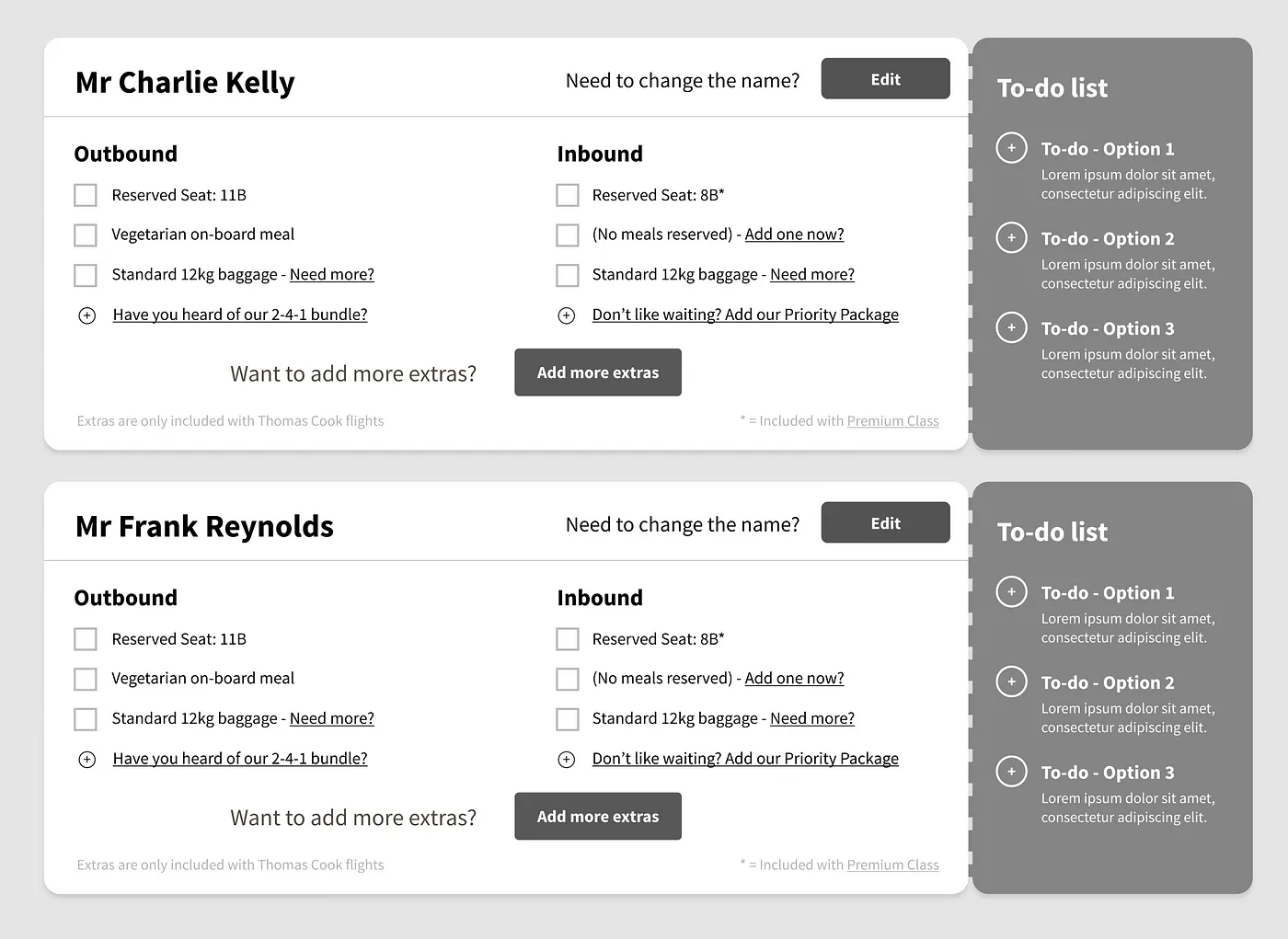
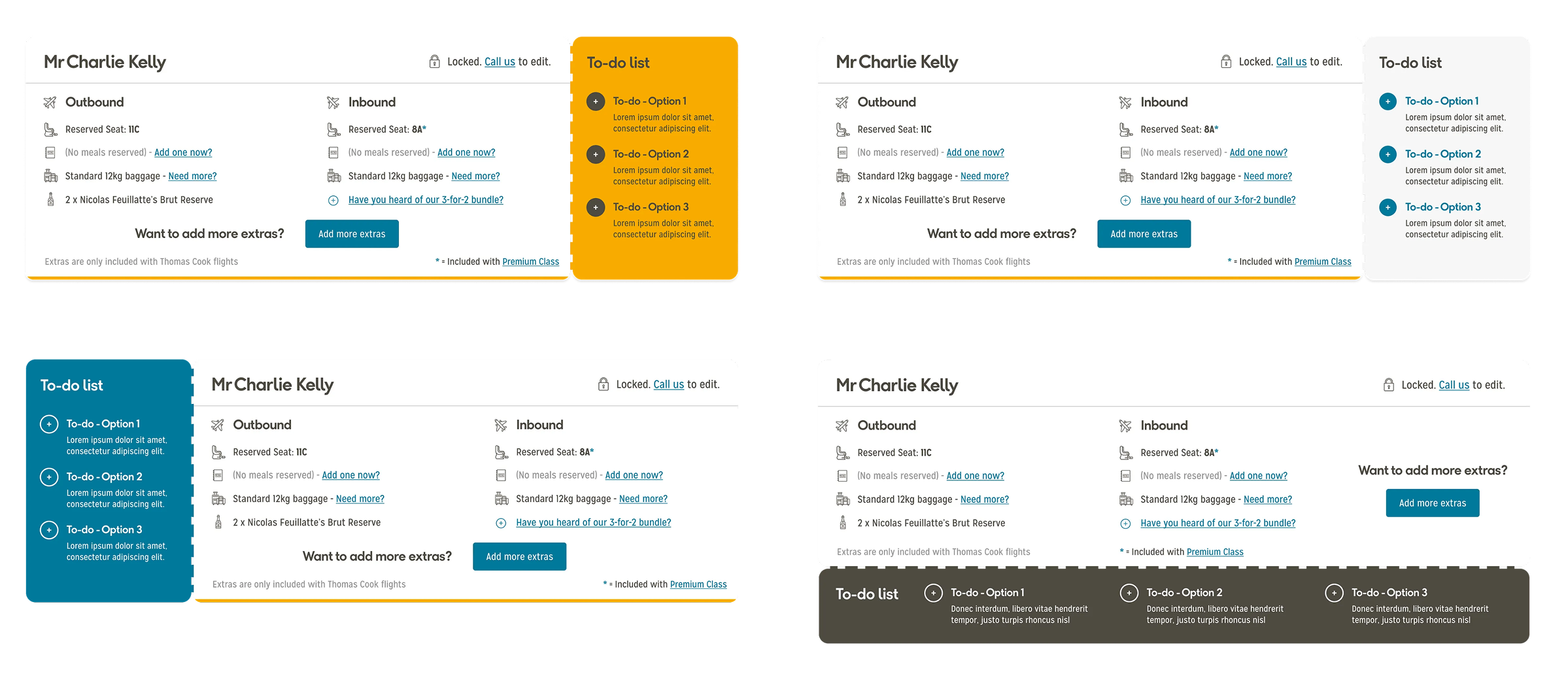
The passenger information component is really starting to take shape here. There were some initial concerns from myself in how long it would make the page if there were 3 or more passengers — but I was more than willing to explore just how I would optimise that. For the moment I was focussed on the actual design of the new component.
Hi fidelity
This is where the component really came together. Once the Thomas Cook Airlines branding had been injected into it, the initial idea sprang into life.
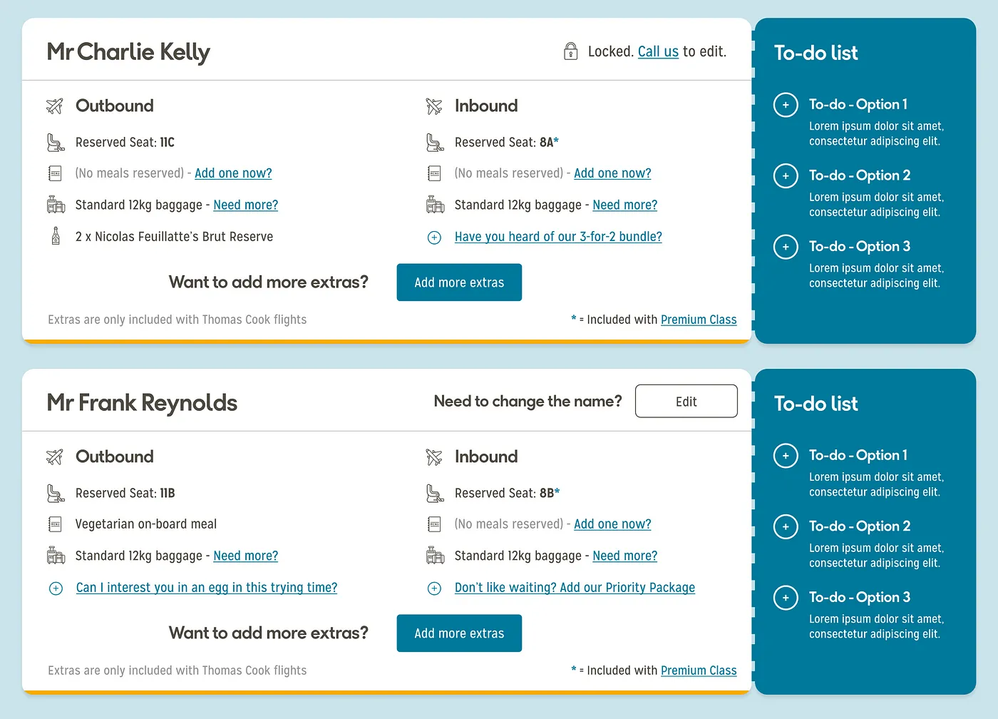
The line icons, on first glance, seemed to work really well, along with the spacing afforded to the different elements.
Checklist hi-fidelity re-work
Based on the feedback received, it was clear that the checklist was the favourite — which shocked us! The overwhelmingly positive feedback made our minds up that this one would be the one to receive immediate refinement.
Working on the fly, and skipping out the wireframe section, I jumped straight into editing the checklist once again.
Taking on board the feedback from the other components — I decided to use icons similar to the cards we proposed. They received some really good feedback, and thought they could work well, especially when combined with a “completed” state.
The text that was in the “open” state would be condensed and re-used, along with the main title.
The idea of the lists expanding was dismissed, and instead opted to link the user to the relevant page in the MMB dashboard. Once the action was completed, it would then be reflected in the checklist.

That was much more like it! I was much, much more happy with that. Then when the user started to complete actions, it really brought it to life.

Here, you can see the user has completed the first two tasks. The user is now able to edit the contact details, but not the API details (a technical limitation).
The greyed-out icons received a little more colour in them, and a “completed” arrow placed over them, which I feel communicated much more effectively to the user that the actions were complete.

There were discussions around what we could do when the user has completed the checklist — perhaps something in the title that indicated all was okay? But sadly that wasn’t something we had time to explore.


