Overview
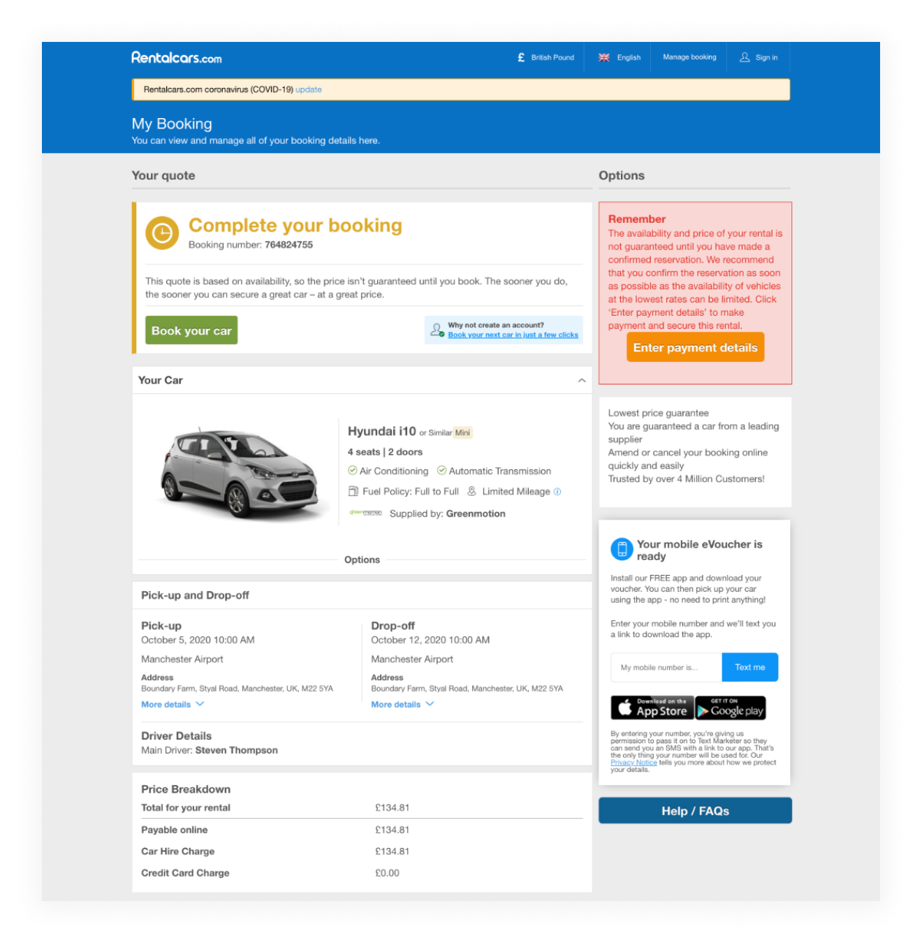
I worked on redesigning the customer booking area for car rentals to bring it in line with BTUI. BTUI was a set of design standards that sat alongside BUI, Booking.com’s main Design System. It was designed specifically for transport products, like car rentals, flights, and taxis. At the time, the booking area was still using something called “Webapp,” which was basically a leftover product from an earlier phase of the business.
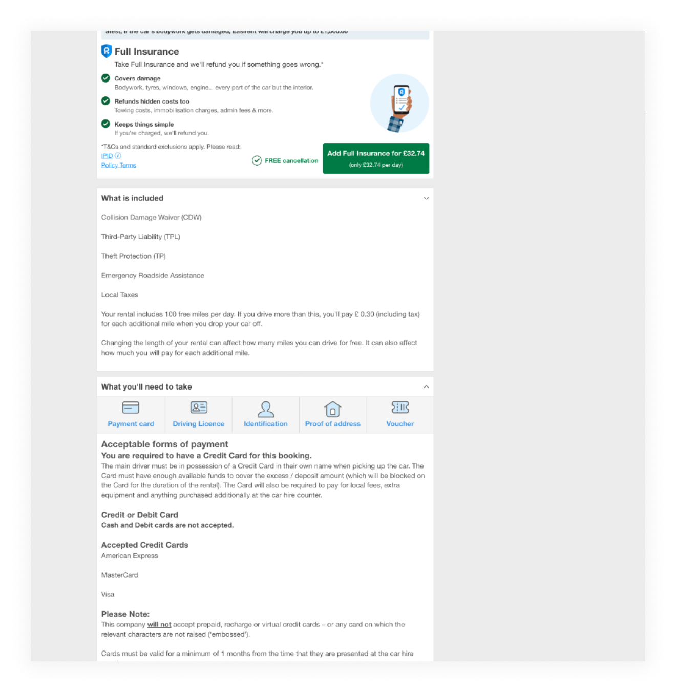
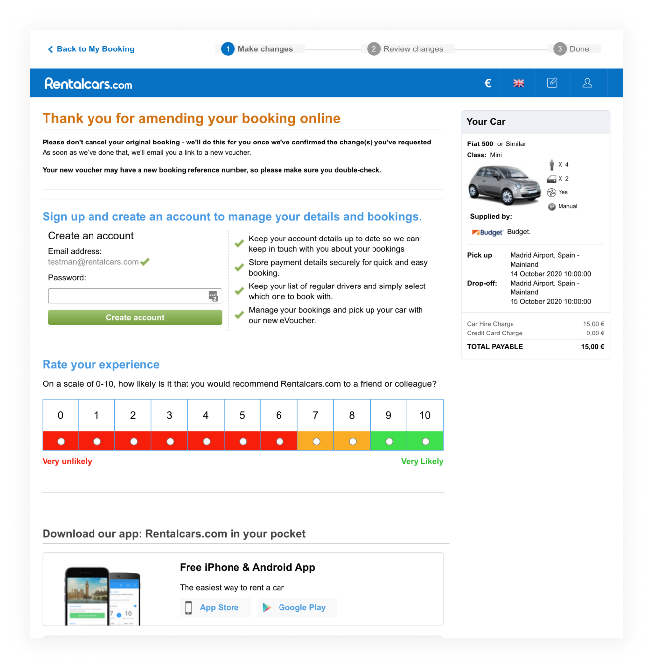
The problem with Webapp was that it had been built up over years by different designers and developers, all with slightly different approaches. There was no real set of rules for branding, layout, or even component styles. It was a bit of a free-for-all. Some parts followed Booking’s older design patterns, others were made up on the spot to solve short-term problems, and over time it had turned into a mismatched collection of random UI choices. It worked, just about, but it felt messy and out of date.
Visually, it looked completely disconnected from the rest of Booking.com. Interaction patterns were all over the place. The colours were off, the buttons behaved differently to what customers were used to elsewhere on the site, and the code underneath it was basically spaghetti code from years of quick fixes and bolt-ons.
This redesign was a chance to clean all that up. It wasn’t just about a fresh coat of paint, it was about rebuilding the whole experience properly, making sure it matched the newer design standards we were rolling out across transport products. More importantly, it was about making it easier for customers to manage their bookings without getting lost or confused.
Initial concepts
Before jumping into design, we wanted to make sure we really understood what customers were using this area for. The booking area wasn’t just a place to view a reservation, it was where people came to make changes, add extras, or cancel if their plans changed. So we started by identifying and mapping out the core user flows. What were the main things people wanted to do here? What tasks actually mattered to them?
The key actions we identified were:
-
Adding extras, like insurance or child seats
-
Changing the booking dates or time
-
Updating driver details
-
Changing the pick-up or drop-off location
-
Cancelling the booking entirely
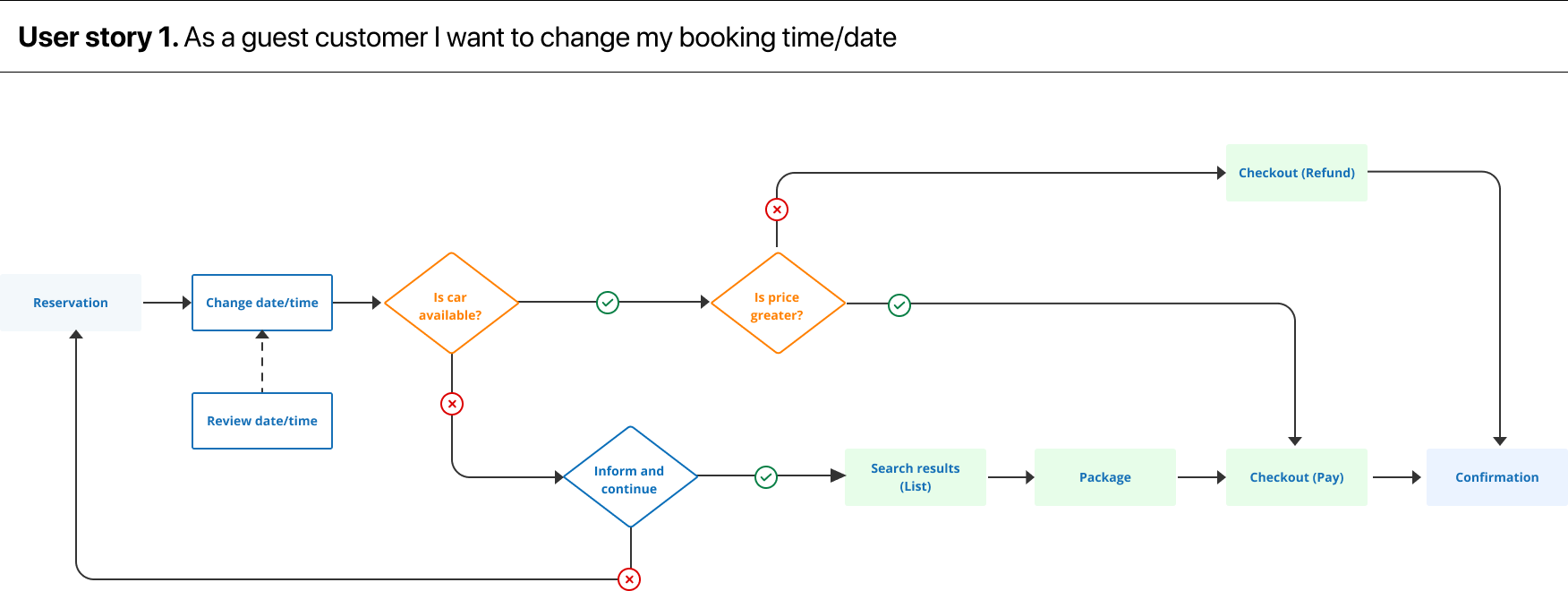
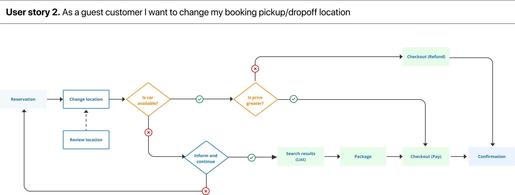
These flows gave us a clear foundation to build from. But before we went anywhere near Figma, we needed to know what wasn’t working in the current experience. So we ran a round of user testing on the original Webapp version.
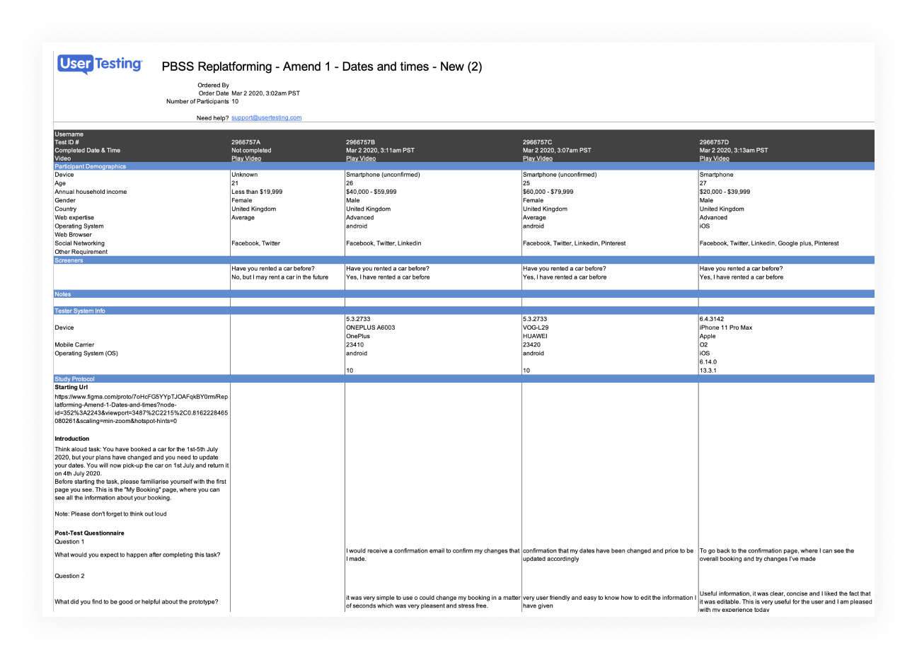
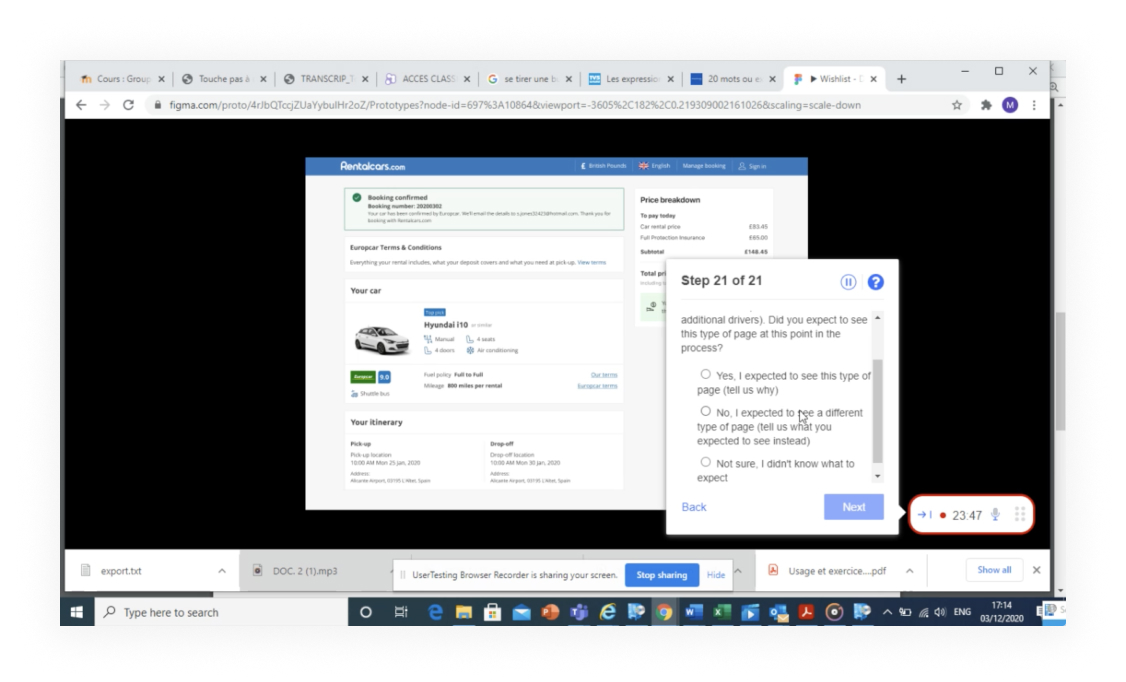
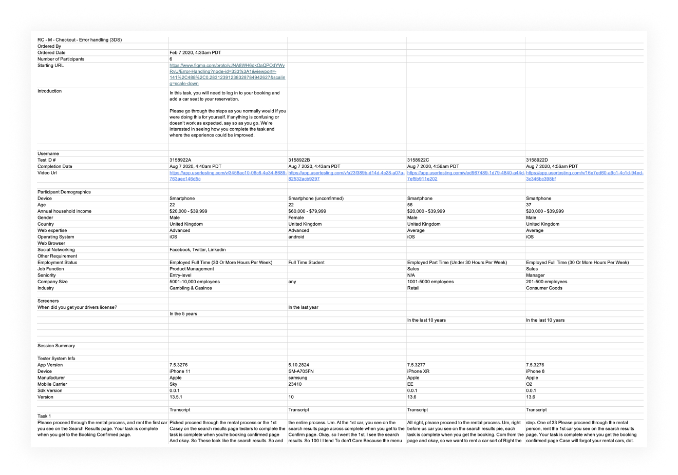
For that, we set up a series of realistic tasks and watched as users tried to complete them. Things like “change the date of your booking” or “add an additional driver” — simple things that should have been easy.
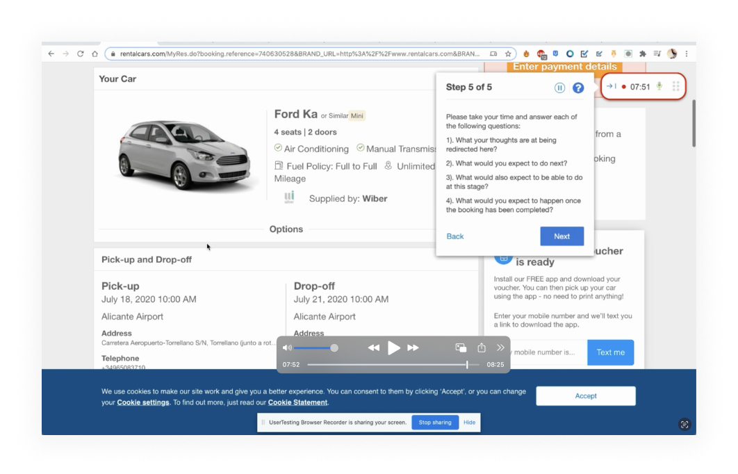
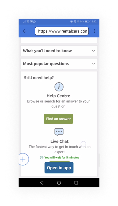
What we found wasn’t surprising, but it was valuable. The layout didn’t help people find what they needed, important actions were hidden or labelled badly, and the overall journey felt clunky.
There were moments of hesitation, uncertainty, and frustration. Some people completed the tasks, but not without effort. Others gave up before finishing.
Further UX input
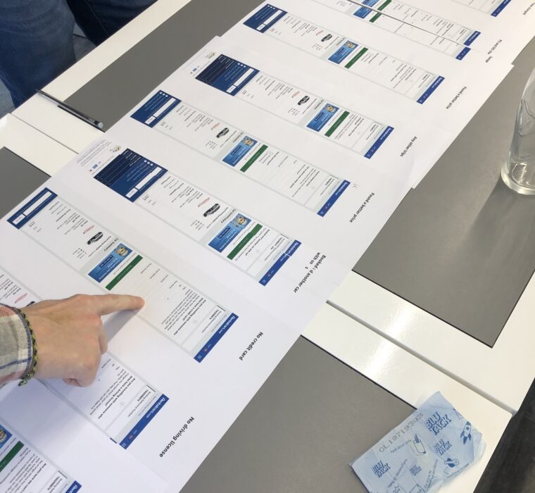
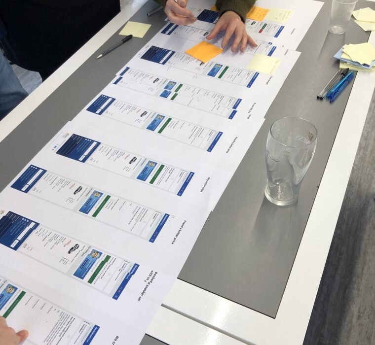
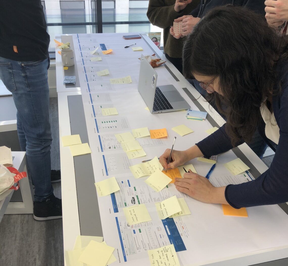
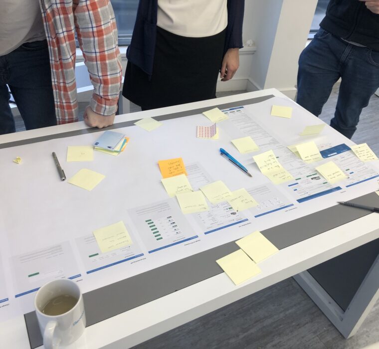
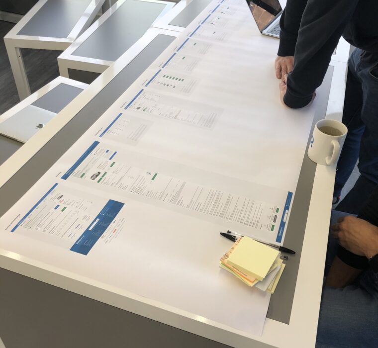
Before we moved into testing the redesigned screens with users, we wanted to get some fresh perspectives from the rest of the team. We printed the designs out at a large scale and put them up around the office, inviting feedback from the wider UX team.
At the time, there were around 20 designers and researchers working in the Manchester office, all with experience across different parts of Booking’s transport products. We encouraged them to comment, critique, and suggest changes to the screens we’d created.
This was a really useful part of the process. Everyone brought slightly different perspectives, whether it was thinking about accessibility, mobile responsiveness, or interaction patterns they’d seen work elsewhere. Some people flagged small usability issues we hadn’t spotted yet, while others questioned whether certain features were clear enough or even necessary.
It helped stress-test some of the assumptions we’d made early on and gave us a broader view before going into formal user testing. Getting that input early meant we were in a stronger position to refine the designs, with fewer surprises later down the line.
Final output and testing
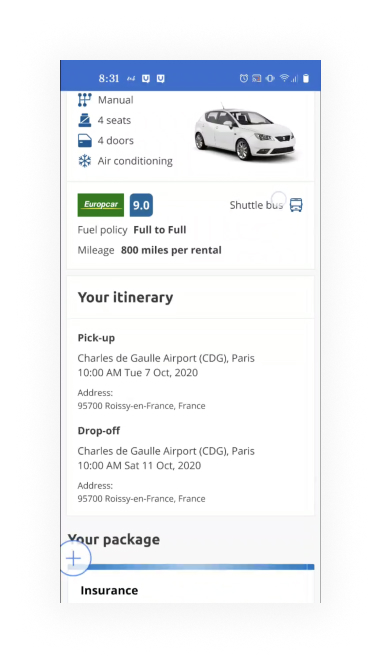
The final designs were a complete transformation from where we started. Every screen had been rebuilt using BTUI components, with a clear structure and a focus on making key actions obvious and easy to follow. Things like adding extras, changing booking details, or cancelling were now right where users expected them to be, with clear calls to action and helpful guidance along the way.
We ran another round of user testing to make sure everything landed the way we wanted it to. This was the point where we could properly check that the changes we’d made actually worked for real customers, not just in theory.
The feedback was really positive. Tasks that felt awkward or hidden before were now completed with confidence. Users said things like “That was easier than I expected” or “I didn’t even have to think about it,” which is exactly what you want to hear in a usability session. More importantly, people were able to complete the tasks quickly, with fewer mistakes or hesitations.
By the end of the project, we’d not only brought the booking area in line with the wider design system, but we’d also removed a lot of the friction that had been frustrating users for a long time. It felt like a proper part of the Booking.com experience at last, and it gave us a solid base to build on for future improvements.


