Chetwood Bank

Bringing a new brand to life with a clear, confident savings journey.

Client: Chetwood Bank.
Date: June 2024
Services: UI, UX
Teammates: Vanessa Destri, Peter Fielder-Shaw

Overview

This project was all about helping Chetwood Financial step confidently into its next chapter as Chetwood Bank. It wasn’t just a new name or a fresh logo. This was a full rebrand that reflected the shift from a challenger financial provider to a fully authorised, trusted bank.

The rebrand itself was developed by an external agency, who provided us with a new colour palette, updated fonts and a refreshed brand direction. Alongside this rebrand, Chetwood was preparing to launch a new Easy Access savings product, making this a key moment to show customers what the new brand stood for.
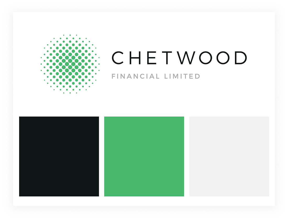
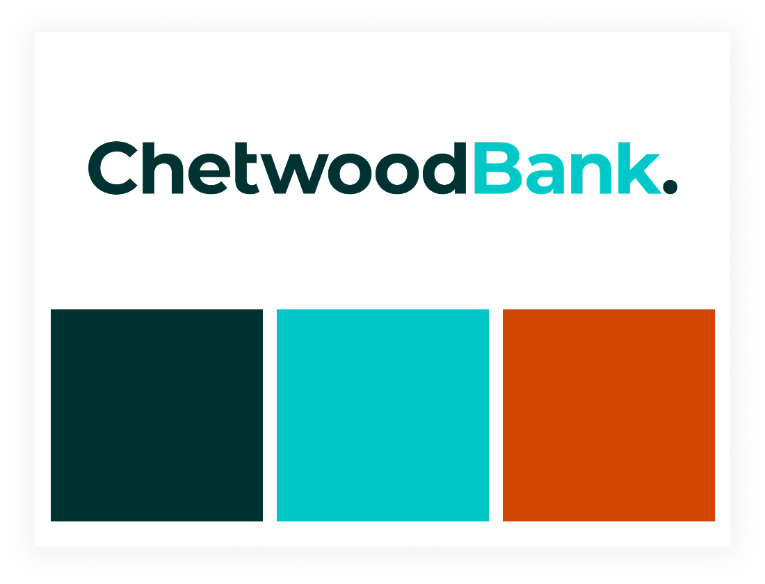
Out with the old ...
... and in with the new.

As part of the move to Chetwood Bank, the business also made the decision to stop accepting new customers across its other savings and lending brands. These products would continue to exist for current customers, but wouldn’t be actively promoted anymore. It was important that these brands were still acknowledged on the new website, with clear links and information to help existing customers get to the right places.

Our job as the UX team was to take all of this and make it meaningful in the product experience. We wanted the rebrand to feel more than just a new coat of paint. Every part of the journey, from landing on the website to opening an account, needed to feel clear, reassuring and aligned with this new direction.

Our audience

We were designing with both new and existing customers in mind. Chetwood had already built up a strong customer base through its savings brand, SmartSave. As part of the rebrand, SmartSave would now begin directing its customers over to Chetwood Bank to take advantage of the new Easy Access savings accounts.

We knew this audience was already familiar with Chetwood as the name behind SmartSave, but Chetwood Bank itself would be new to them.

That meant we had to build trust quickly, show the value of the new accounts and make the transition feel seamless. Customers arriving from SmartSave needed to understand what was changing, why it was a good thing, and how they could get started without any hassle.
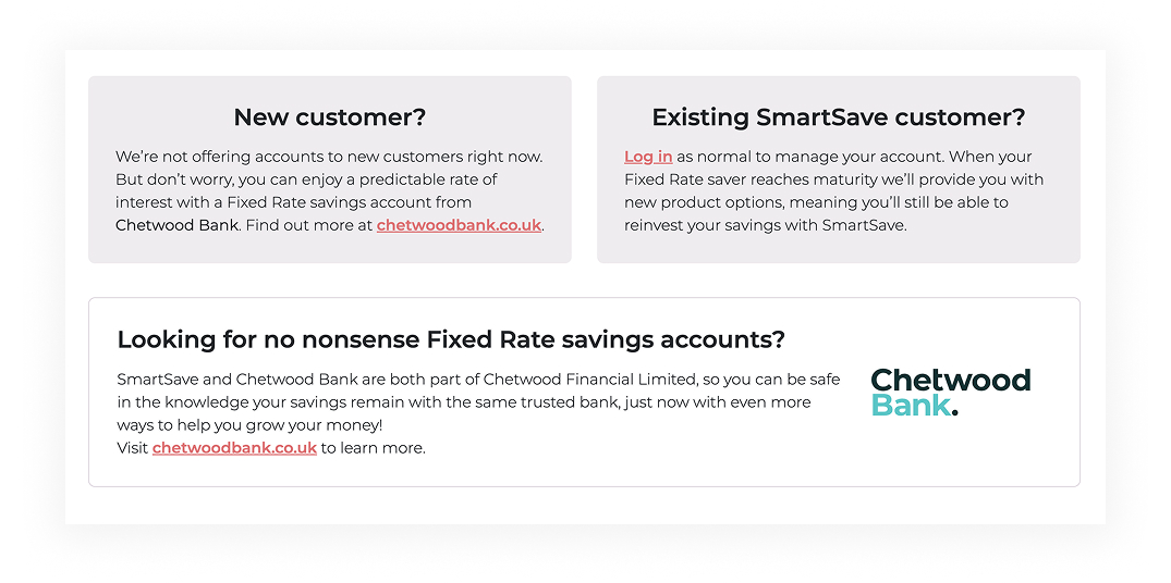
A signpost on the SmartSave website.

We also had to think about how to clearly support existing customers of SmartSave’s previous products. It was important to provide clear routes to the right places for them, while encouraging new customers to explore the fresh offering under Chetwood Bank. The challenge was creating an experience that reassured returning customers while offering something exciting and straightforward for new ones.

Consumer duty

The Financial Conduct Authority’s (FCA) Consumer Duty came into force on 31 July 2023 and seeks to ensure customers receive “good outcomes”.

This means that products and services should meet customer needs and offer fair value. Customers should also be provided with support when needed and clear communications that they understand.

Customers must be able to access:

  • Helpful and accessible customer support to help them solve problems and switch or cancel their product.
  • Timely and clear information that is easy to understand, so customers can make good financial decisions.
  • Products and services that are right for them. Banks should not push products and services customers don’t need.
  • Products and services that provide fair value.
  • Additional support if they are vulnerable.

This was also something that we needed to take into account as a UX team when crafting the Chetwood Bank experience.

The savings platform

Originally, the plan was to build our own in-house savings platform to sit alongside the new Chetwood Bank brand. It would have given us full control over the experience, allowing the UX team, developers, marketers and everyone in between to shape something that truly reflected the needs of our customers and the ambitions of the business. Unfortunately, due to time constraints, that idea had to be parked.

Instead, we went with an out-of-the-box solution provided by Sandstone Technologies. While this meant we could get the product to market more quickly, there was a real sense of missed opportunity. Building our own platform would have been a brilliant cross-team project, allowing us to design something from the ground up with our customers at the heart of it.

sandstonetechnologies.com

The Chetwood Bank website would serve as the front door, introducing the products, guiding customers through the application journey and then linking out to the Sandstone platform for account management. It wasn’t the fully joined-up experience we’d wanted, but it gave us a foundation to build on in future.

Our goals

When we started thinking about the new Chetwood Bank website, we knew it had to do more than just look fresh. It needed to work hard for customers.

The site had to clearly communicate the new brand’s values and help people feel confident choosing Chetwood Bank for their savings. At the same time, it had to make life easier for customers by providing quick access to support and simple ways to manage their accounts. With that in mind, we set three clear goals to keep us focused throughout the project.

Show customers who we are, build immediate trust with the new brand, highlight FSCS protection, and guide them to open an Easy Access savings account.
Give customers fast access to the support they need through our Fast Answers help section, with clear routes to get in touch by email, phone or live chat if they needed more help.
Provide an easy, signposted journey to the Sandstone platform so customers could log in and manage their savings.
Those goals guided everything we did on this project. It wasn’t about showing off flashy design or overcomplicating the experience. It was about building trust, making things simple, and giving customers what they needed without frustration. Every page, every word and every interaction was shaped to support those outcomes.

Getting started with design

We kicked off the design process the way we always like to: by getting ideas out of our heads and down onto paper. Before jumping into Figma, we spent time sketching out early ideas as a team. This gave us a chance to quickly explore different approaches to the layout, content hierarchy and key journeys without getting too caught up in the details too soon.

Working this way early on meant everyone could get involved, not just designers. We had input from UX, developers, marketing and stakeholders across the business. By sketching together, we could share ideas, challenge each other’s thinking and start shaping a shared vision for how the site could work.

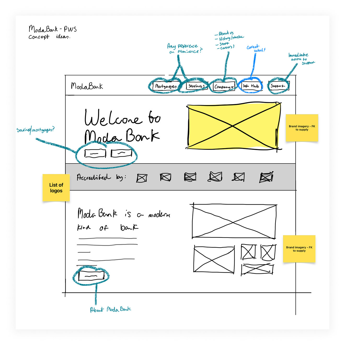
Initial rough sketches of the Che- sorry - ModaBank website.
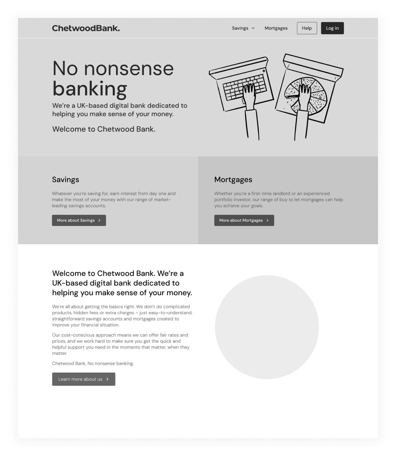
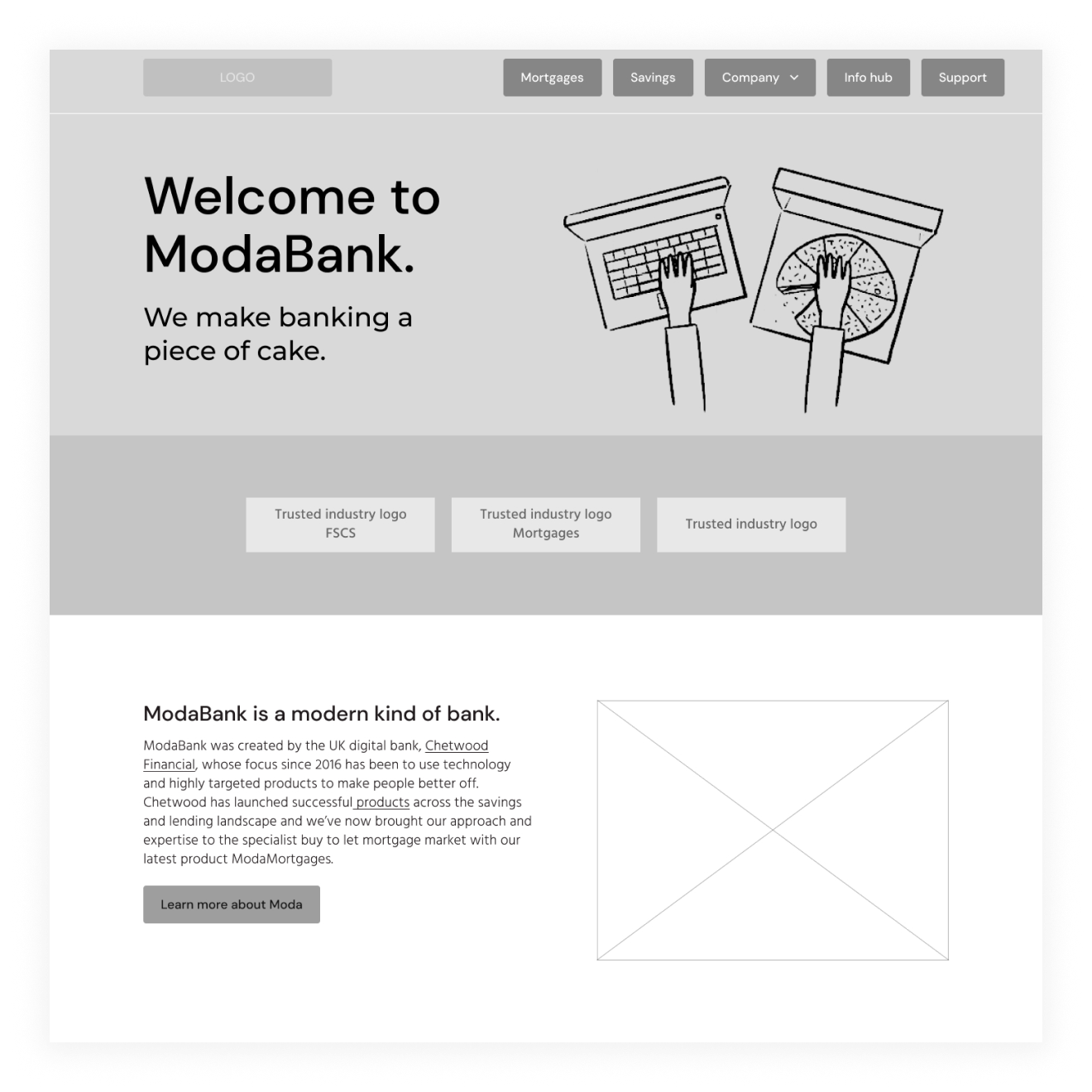
And the digital wireframe.

As we moved from the early sketch into wireframes, we started to refine the structure based on feedback and what we learned during early reviews. One of the biggest shifts we made was in the site navigation. Initially, the menu had been quite broad, covering lots of different areas equally. As the project progressed, it became clear that the primary focus for the site, especially at launch, was savings. The menu was slimmed down to reflect that priority, making it quicker and easier for users to head straight to the savings products.

We also changed the label of what was originally called “Info Hub.” While “Info Hub” sounded friendly, it didn’t make it immediately obvious to users that this was where they would find support and answers to their questions. We simplified it to “Help,” making the purpose clear and giving users confidence that this was the right place to go if they needed assistance.

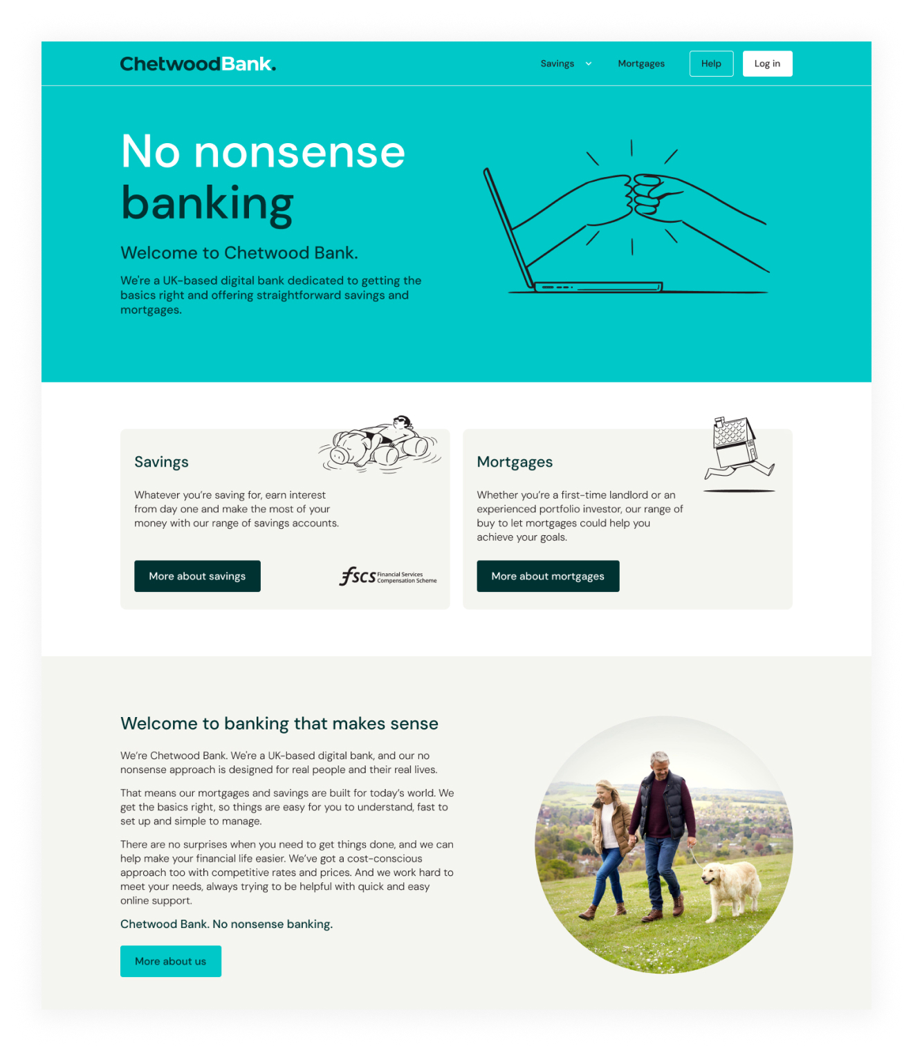
The revised Chetwood Bank wireframe.
Brought to life with the branding.

Another key change was the area just below the main Hero section. Early versions kept this space fairly open, but we decided to make better use of it by adding two blocks with direct links into savings content. This gave users more obvious next steps straight from the homepage, helping guide them quickly towards the main goal of opening an Easy Access savings account.

These changes worked together to tighten up the experience, reduce distractions and put the focus where it needed to be: reassuring users and helping them start saving with Chetwood Bank.

Visual assets

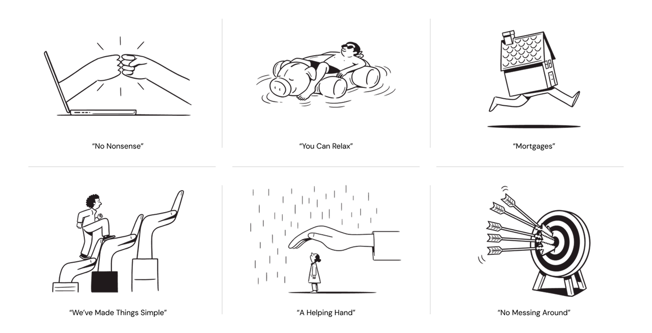
Alongside the UX work, we also started bringing in visual assets to help shape the overall look and feel of the site. We worked with a freelance illustrator to create a set of bespoke sketches that would feature across key parts of the website.

Illustrations provided by the freelancer.

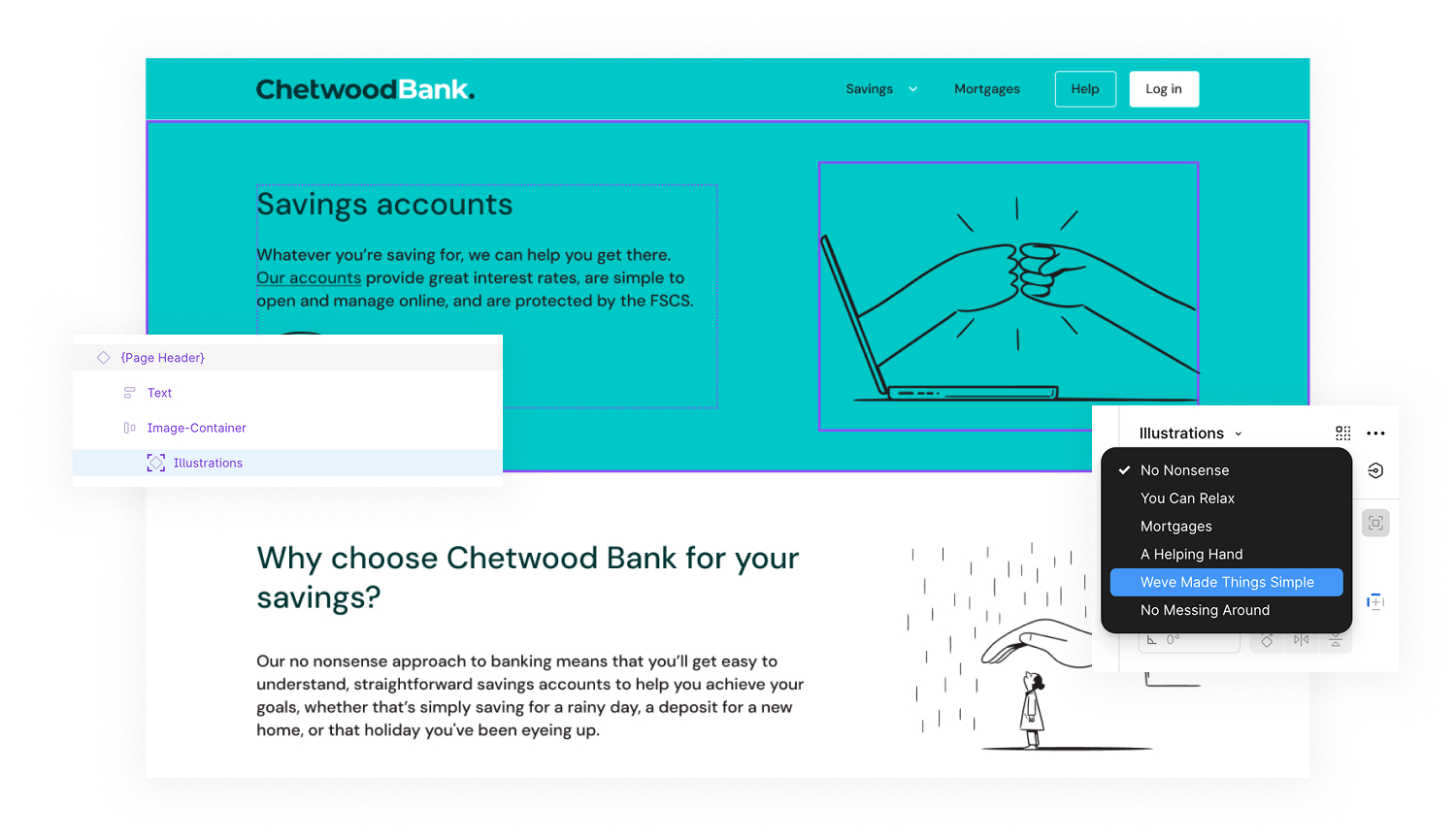
These illustrations added personality and warmth to the experience, helping to soften the more formal tone that often comes with financial products. The illustrations were designed to feel friendly and approachable, while still sitting comfortably within the new brand direction.

The illustrations embedded in one of the global header components.

To make sure the illustrations and photography worked smoothly across the site, I built them into our flexible Figma component system. This approach gave us loads of flexibility. By embedding the visuals directly into components, we could quickly test different layouts, swap imagery, and see how the assets worked across various screen sizes without breaking anything.

For the illustrations, I created reusable components with adjustable sizing and positioning, making it easy to drop them into different sections without having to start from scratch each time. The photography was handled in a similar way, with predefined slots for imagery that helped maintain consistency across pages.

Stakeholder collaboration

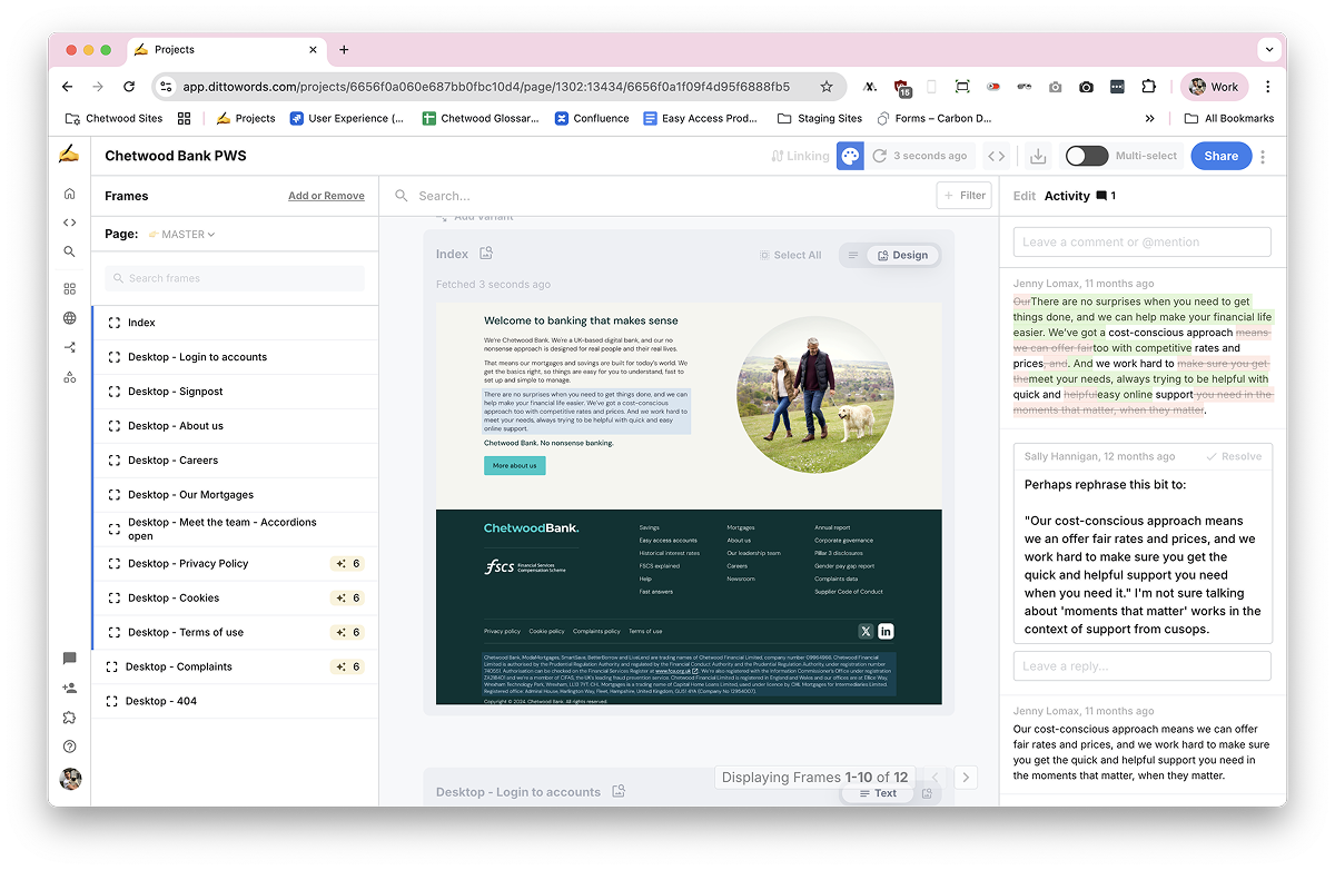
To help manage the copy for the Chetwood Bank website, we brought Ditto into the workflow. This gave us a single place to write, review and approve all the copy directly in Figma. It made collaborating with stakeholders much easier, especially when we needed feedback or sign-off on key messaging.

At Chetwood, discussing the copy was often over multiple channels, such as email, Slack conversations or in meetings. With Ditto, it provided a single source-of-truth when it came to the wording of the site, with clear stages (draft, for approval and approved) and feedback trails.

Discussions around the copy for the Chetwood Bank home page.

One of the biggest benefits was being able to show copy in context. Instead of sharing documents or screenshots, stakeholders could see the words exactly where they would appear on the site. It cut down on confusion, reduced back-and-forth, and made the whole process much smoother. Adding Ditto into the mix was quick and easy, and it helped keep everything organised as the project grew.

User testing and launch

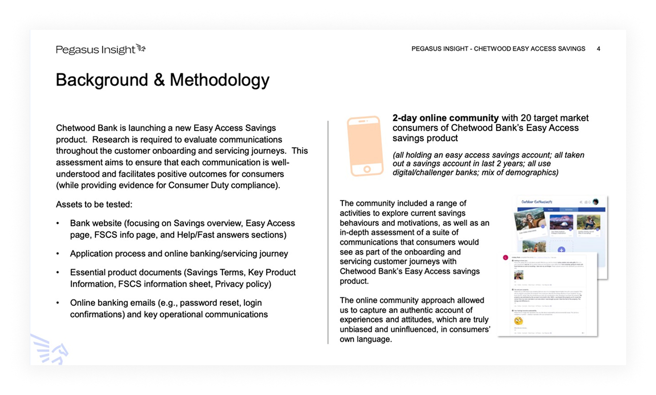
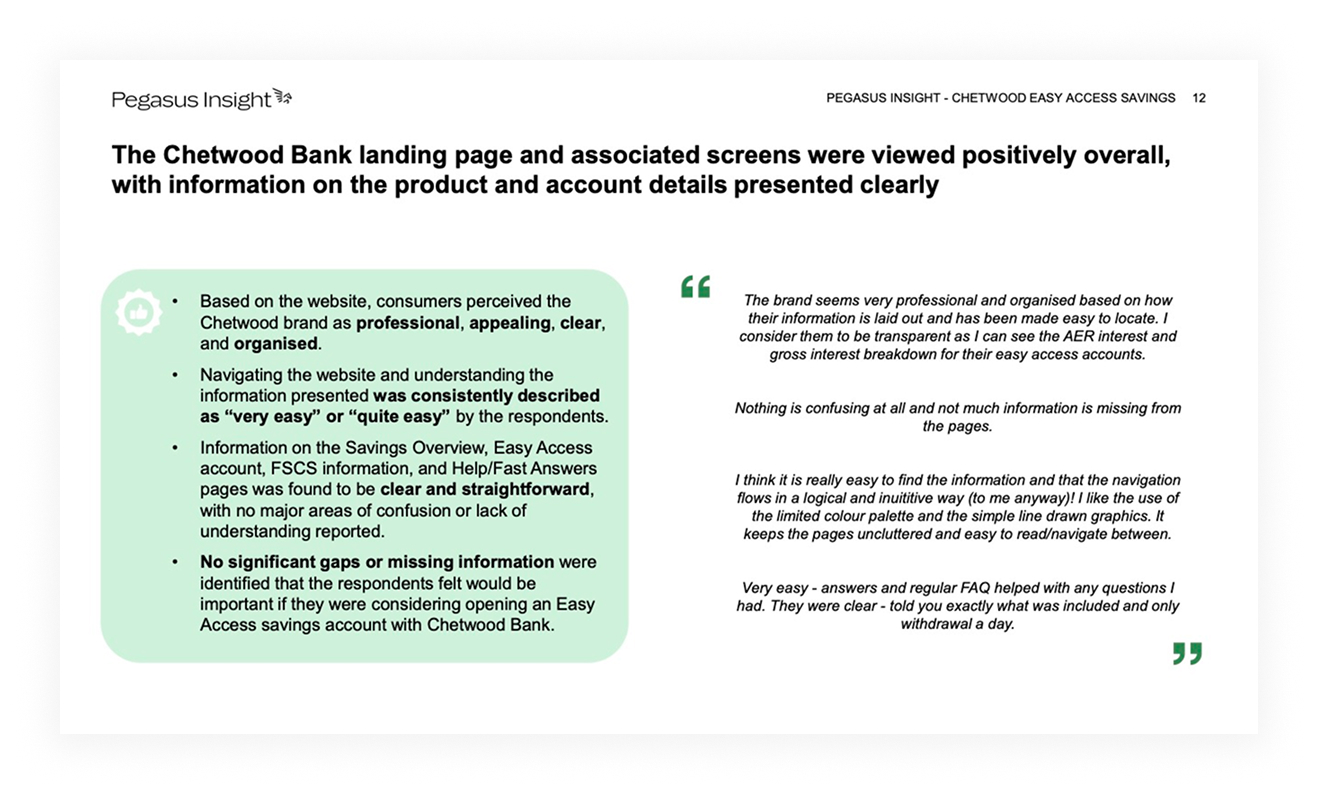
Before launch, we carried out user testing to make sure the site was doing what it needed to do for real customers. This was handled by Pegasus Insight, who worked closely with us to run the sessions and gather feedback. The testing focused on the core journeys, particularly around signing up for a savings account and finding help if needed.

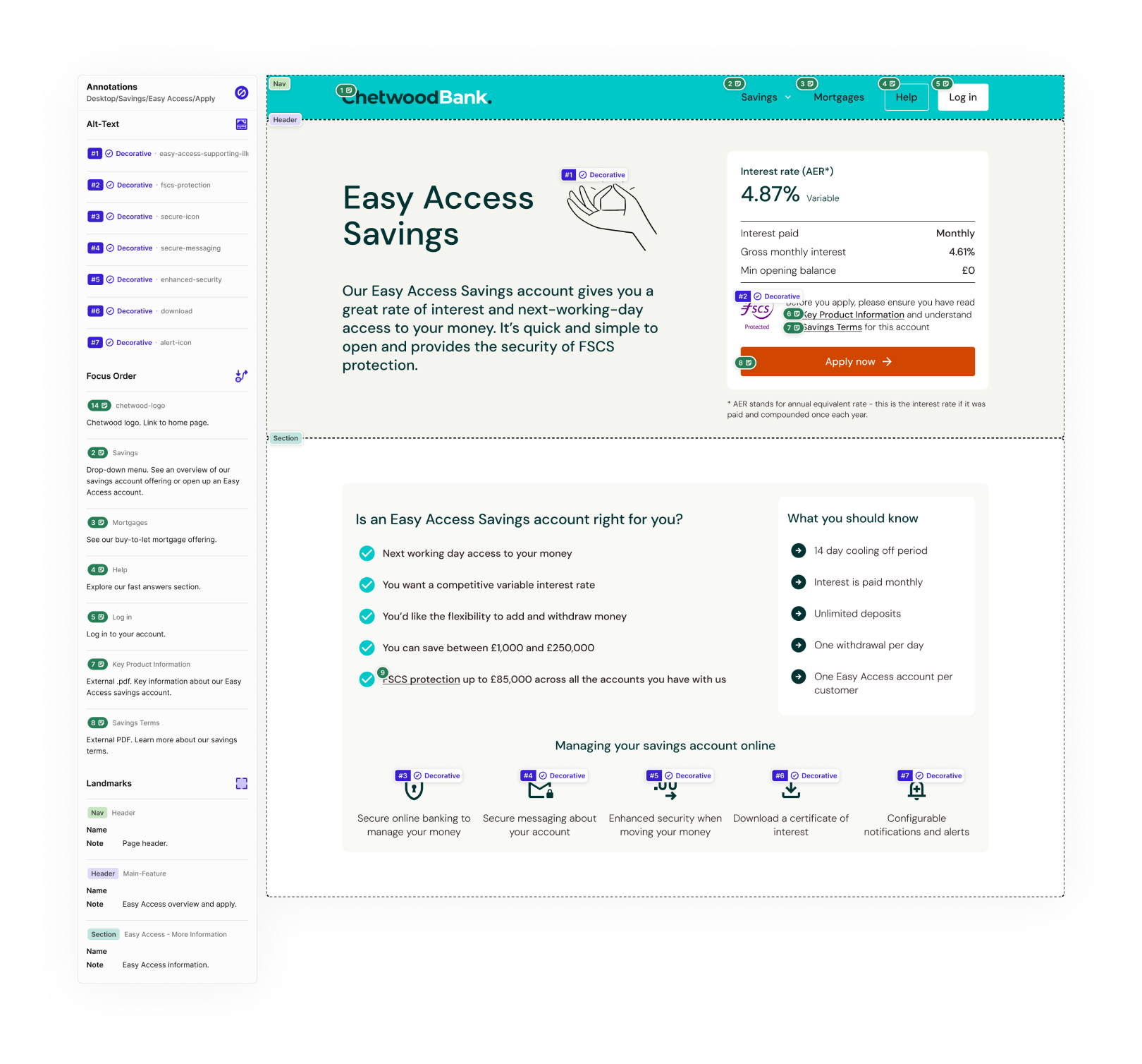
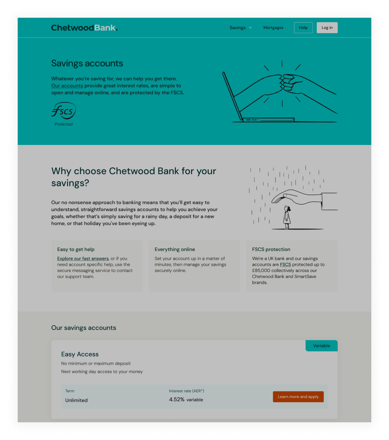
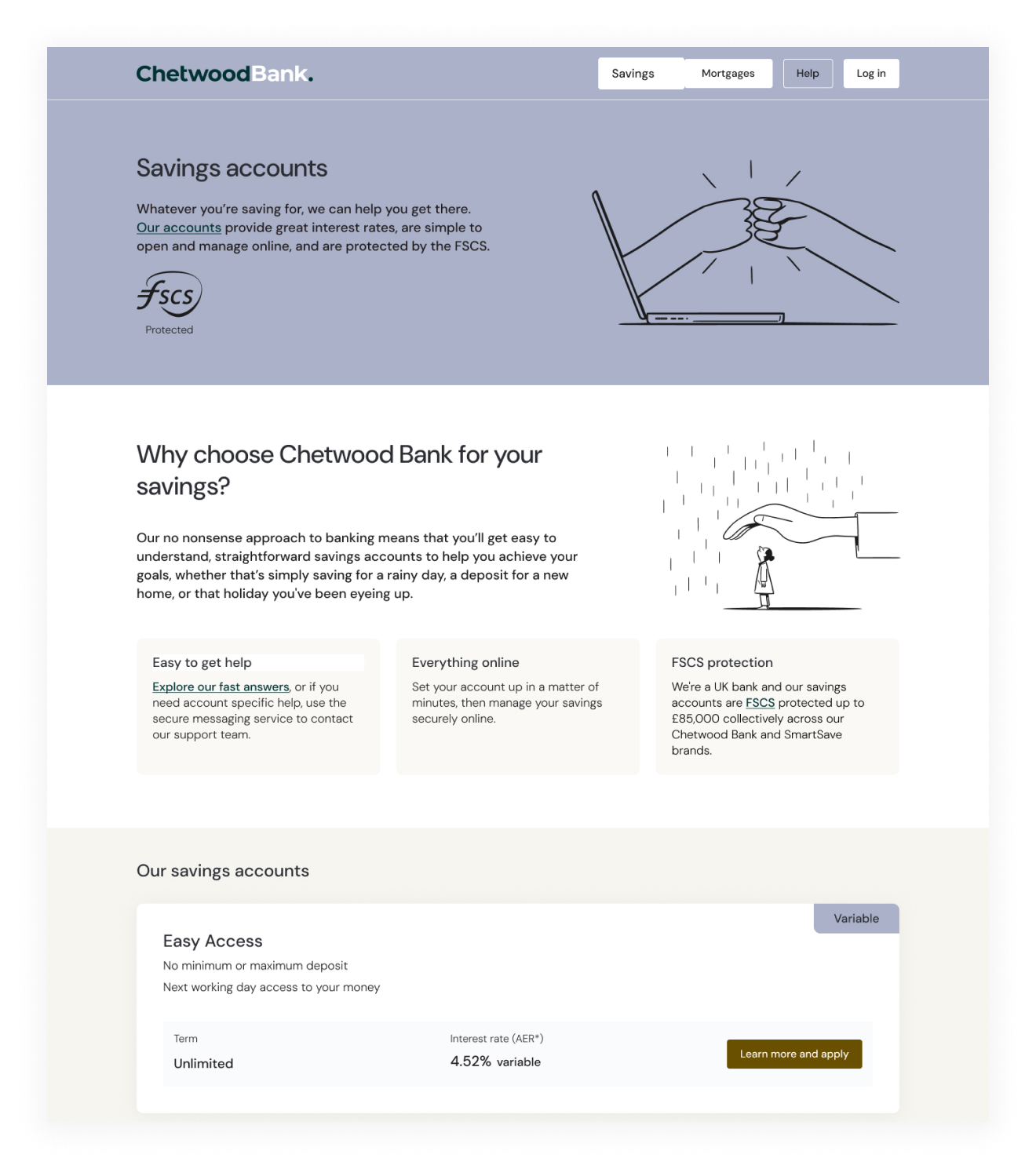
Accessibility was also a key part of the process. The UX and development teams worked together to test the site against WCAG guidelines, aiming for level AA compliance. We checked everything from colour contrast and keyboard navigation to screen reader support. Once we were satisfied with the results, the work was reviewed and approved internally before launch.

Setting the landmarks, alt-text and focus order of the Easy Access page.
Simulating loss of contrast on the Savings page.
And protonopia.

With testing completed and sign-off from the wider team, we launched the new Chetwood Bank site. It was a big moment, bringing together months of work from across design, development, marketing and wider teams. Seeing it live, helping real customers, was a proud moment for everyone involved.

Incremental updates

Since the Chetwood Bank website went live, we’ve continued to make regular updates and improvements as a UX team. Rather than treating the launch as the finish line, we’ve taken an incremental approach, refining and evolving the site based on feedback and changing business needs.

One of the major additions was the launch of a new range of Fixed Rate savings accounts, offering terms from 1 to 5 years.

This required updates to product pages, journeys and supporting content, which was made much easier as we designed the initial product card with this in mind.
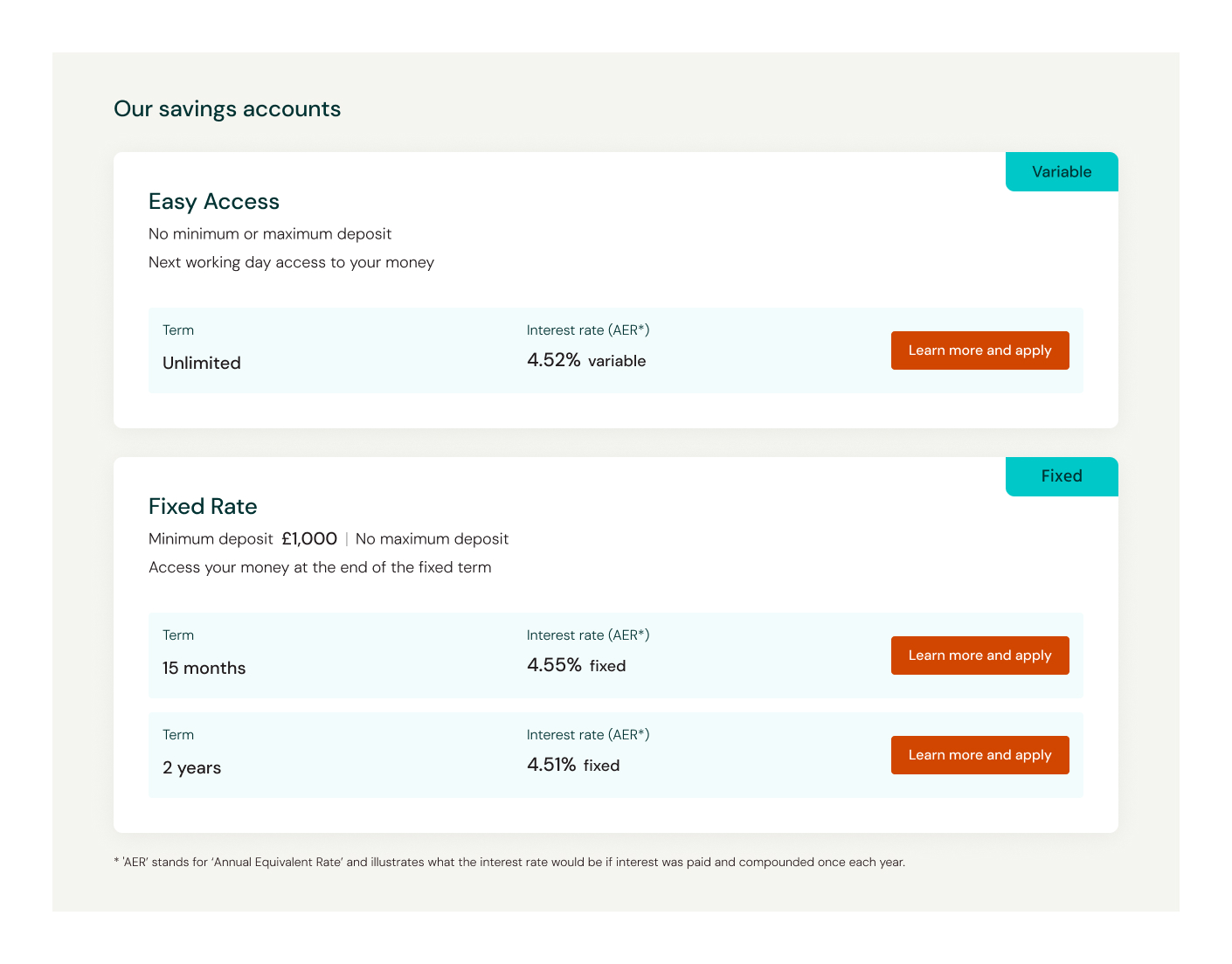
The Fixed Rate offering.

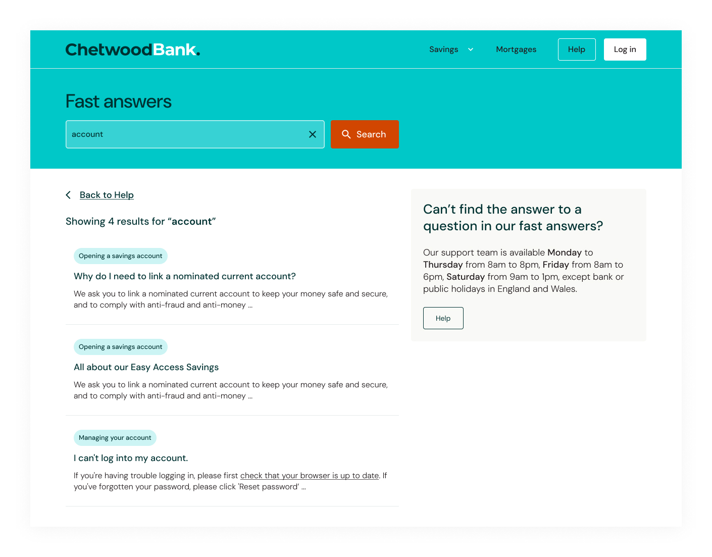
We also introduced more advanced search functionality within the Fast Answers section, making it quicker for customers to find the help they need.

These updates are part of an ongoing effort to keep improving the experience, making sure the site grows alongside the bank’s ambitions.