Overview
Moda Mortgages is a brand new specialist lender created specifically for the buy-to-let market. Designed with brokers and landlords in mind, the brand was set up to offer a fresh, modern take on buy-to-let lending.
This was my first solo project as part of the Chetwood UX team to help shape the online experience for Moda from the ground-up. This wasn’t just about creating a nice looking website. It was about building something that brokers would genuinely want to use. Our goal was to make it easy for them to find the information they needed, get quick decisions, and ultimately feel confident putting their clients with Moda.
Because Moda was launching into a busy and competitive market, we knew the experience had to stand out. We also had to balance two things at once: helping brokers with their day-to-day tasks and bringing Moda’s new brand personality to life online. This was a chance to help build a lender’s reputation right from day one.
I worked across several key areas of the launch, from shaping the site’s structure and navigation to refining the journeys for product selection and application. Along the way I collaborated closely with development, marketing, and the wider mortgages team to make sure what we were designing wasn’t just useful. It also had to be achievable within our timelines and work for the business too.
A Smarter. Faster. Simpler solution
From the very start, everything we designed was centred around two key groups: brokers and buy-to-let landlords. Brokers were the main focus, because they’re the ones recommending lenders to their clients. If we could build something that made their working lives easier, we’d be giving Moda a real advantage in a competitive market.
Landlords were also an important part of the picture. They needed to feel confident that Moda could help them grow their property portfolios and manage their investments properly. Even though brokers were our main audience, we knew that landlords would often be checking out the website themselves before deciding whether to go ahead.


These two audiences had slightly different needs, but one thing was consistent. They both wanted clear, no-nonsense information. They didn’t have time to wade through jargon or get lost in complicated processes. That’s where Moda’s brand promise came in. The tagline “Smarter. Faster. Simpler.” became the thread that tied everything together. Every part of the user experience had to reflect that. If something wasn’t smart, fast or simple, it wasn’t right for Moda.
Having that clear focus on brokers and landlords helped us make better decisions throughout the project. Whenever we faced tricky choices about content, journeys or features, we kept coming back to one question. Does this help a busy broker get what they need quickly, or help a landlord feel confident they’re in safe hands? If it didn’t, we reworked it until it did.
Personas
One of the key outcomes from our early research was the creation of a set of personas. These were quite long and detailed and proved to be efficient tools that helped us keep real users front of mind throughout the project.


… but first, the Lead Gen site
Before we could launch the full Moda Mortgages website, there was an important first step. We needed to build a smaller lead generation site to start creating awareness and interest in the brand. This was like a soft introduction to Moda, giving brokers a first look at who we were and what we stood for.
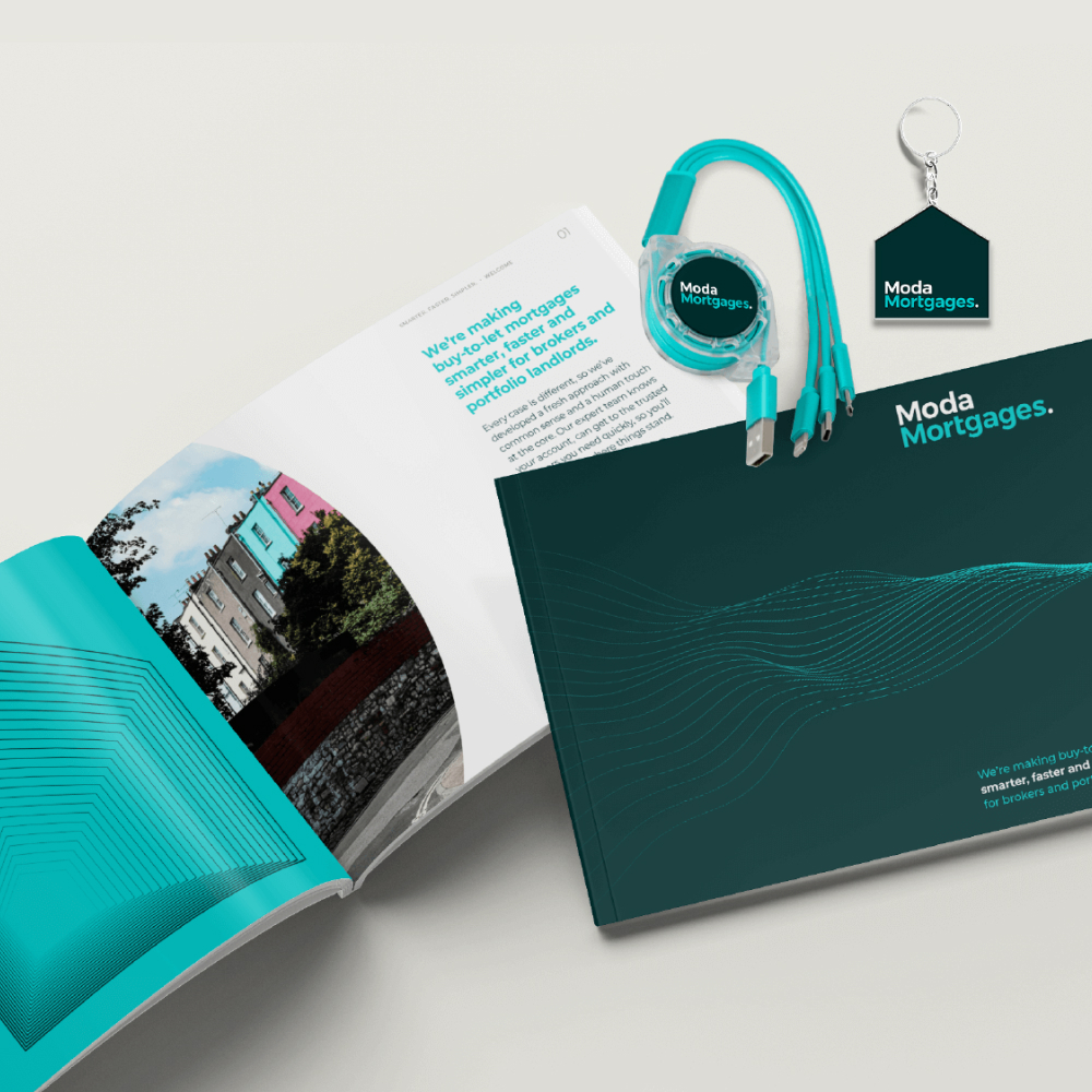
Partway through the work on the lead gen site, there was a brand refresh across Chetwood Financial. As part of that, we introduced the Hind typeface across all new digital work (except headers), along with an updated colour palette that aligned Moda more closely with the new Chetwood Bank brand.


This shift gave the site a more modern, consistent feel and helped us position Moda as part of something bigger, while still giving it a distinct personality in the buy-to-let market.
The lead gen site itself was simple but purposeful. It gave visitors a clear explanation of what Moda Mortgages was all about.
We introduced the brand, explained our focus on the buy-to-let market and made it clear what set us apart from other lenders. It also included an overview of Chetwood Financial, the parent company behind Moda. This helped add credibility, showing that while Moda was new, it was backed by an experienced team with a strong track record in financial services.


Another important part of the lead gen site was introducing the people behind the brand. Brokers often want to know who they’re going to be dealing with, so we made sure to highlight key team members and decision makers. Finally, we included clear points of contact so interested brokers could get in touch and start building relationships with the team.
This first step gave Moda a chance to start talking to the market and build early connections while we worked behind the scenes to design and develop the full experience.
Crafting the experience
With the completion of the Lead Generate site, we knew that the next iteration of the ModaMortgages website had to be more than just a shop window. It needed to be a proper working tool for brokers. Brokers are busy people. They don’t have time to wade through jargon or wait around for answers. Everything we designed had to respect that and make their lives easier.
To keep things focused, we set three clear goals for the site. These acted as our guide for every decision we made, whether it was about design, content or functionality.
Our goals
After sifting through the user research, it was very clear that the brokers wanted 3 crucial things from the company:
- Immediate decisions on lending
- Lending criteria that wasn’t confusing
- Fast, multi-channel support

At the heart of the site was the buy-to-let calculator. This wasn’t just another tool hidden in a menu. It was the starting point for most brokers. The aim was to give them an immediate sense of whether Moda could lend on a particular case. If the answer was no, we told them straight away. If it was a yes, they could keep moving forward with confidence.
The ability to generate a DIP (Decision In Principle) was not on the roadmap for this particular release of ModaMortgages, but something that could potentially be integrated further down the line.

Brokers need the details, but they don’t need a wall of text. While the actual lending criteria copy would be worked on by the marketing and mortgage teams, we hypothesise ways we could present the lending criteria in a way that was structured and easy to scan. No jargon, no unnecessary steps, just the key facts they needed to help their clients.

Even with good tools and clear information, we knew that brokers value personal relationships with lenders. The site needed to help build that trust by offering quick access to real people when brokers wanted that extra bit of help. With this we needed to display:
- A dedicated phone number
- An email address
- A live chat
- Individual contact details for the relative brokers